The rules of brand design are constantly being rewritten, influenced by everything from audience behaviour and accessibility to cultural influences and fashion trends.
It would be easy to assume that brand design is on an upward trend of originality and innovation as designers learn to adapt to the constraints of modern technology, as well as the whims and wants of digitally savvy consumers.
However, the reality is quite the opposite.
In 2019, I wrote about how Slack’s rebranding (or “Reblanding”) was emblematic of a general movement towards minimalism and over-simplification in brand design.
In the years since, that trend has only strengthened.
So, what is it that is causing businesses to move away from their iconic and distinctive identities in favour of simplified visuals?
The Culture of Immediacy
The constant evolution of modern technology is shaping the way that consumers engage with brands and products.
In the digital space, brands live and die by their ability to appeal to users efficiently, making the most of limited screen space and overcoming ever-shortening attention spans.
It is estimated that the average person sees between 6,000 and 10,000 advertisements a day across a wide range of devices. Cutting through the noise is vital.
This has had a considerable impact upon interactive brand design. The emphasis has shifted to simplicity, adaptability and brand recognition in order to engage users quickly and efficiently, consequently reducing the importance of bold and original visuals.
A brand which can be adapted to function just as effectively on a phone screen as it does on a roadside billboard or TV advert will ultimately be more successful than one which is aesthetically unique but cannot be scaled up and down to suit certain spaces and mediums.
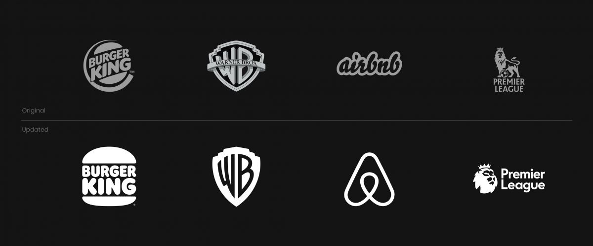
To solve this problem, established international brands like Warner Bros, the English Premier League and Burger King have undergone lengthy and expensive rebranding processes in recent years. They ultimately settled upon a simplification of their original branding, with much of their original flair and creative expression removed.
In this way, the culture of immediacy has led to a decline in originality within brand design, creating an environment where simplicity and efficiency is rewarded over uniqueness.

The "Golden Ratio"
According to Forbes, consistent brand presentation across all platforms increases revenue by up to 23 percent.
Considering how versatile and recognisable a successful modern brand needs to be, designers have taken pains to ensure that the logos and brand marks they create can be used effectively across a wide range of mediums and spaces.
The new Warner Bros. logo, for example, has taken the iconic Warner Bros. shield and simplified it using the classical proportions of the Golden Ratio.
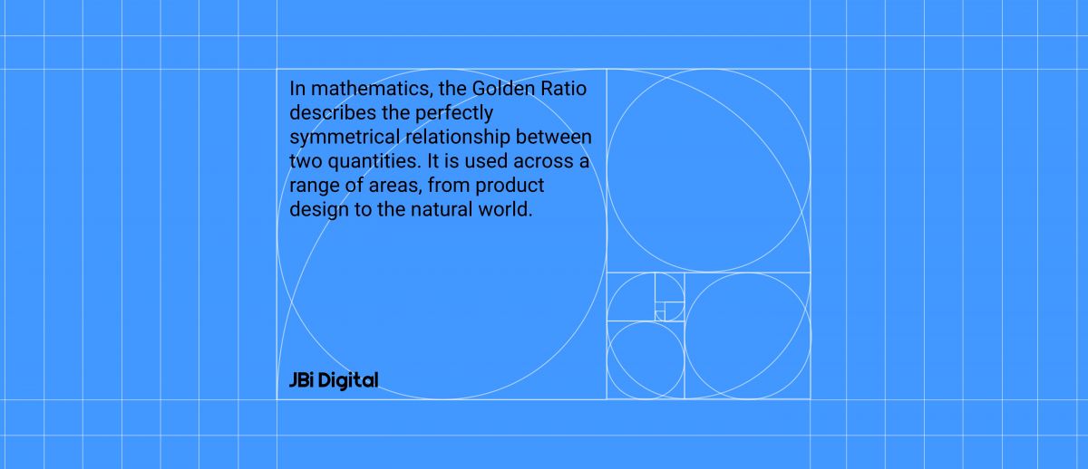
In mathematics, the Golden Ratio describes the perfectly symmetrical relationship between two quantities. It is used across a range of areas, from product design to the natural world.
By working within its parameters, brand designers are able to create simplified and aesthetically pleasing brand marks which incorporate the most recognisable elements of their brand while remaining adaptable and consistent.
While the new Warner Bros. logo achieves this, it loses a lot of what made the original brand so unique. The shaded blues and golds have been replaced by a flat blue, the 3D elements have been flattened and the font has been simplified.
In the words of Pentagram, who designed the new logo:
“The logo has been optimized to perform across various platforms and scales, from the small spaces of the digital world to giant installations like the iconic water tower on the Warner Bros. studio lot.”
Ultimately, business pragmatism will almost always trump creativity and innovation.
And so the new Warner Bros. branding does its job – no matter how dull it is or how strong the backlash has been from fans and nostalgia junkies.
we need a complete shutdown of graphic design until we can figure out what the hell is going on pic.twitter.com/yvx7asRB2M
— Liz Franczak (@liz_franczak) January 18, 2021
Opportunity Knocking to Buck the Trend?
It is not all doom and gloom on the creativity front – in the wake of established, international businesses toning down their brands, some brave companies have seized the opportunity to make a big, creative splash.
Established companies are often limited by internal processes and politics, but growing businesses are able to play, take risks and divide opinion in order to establish themselves.
This means that startups and younger companies have more opportunity than ever to take fresh, alternative approaches in order to stand out and engage new consumers.
Oatly are a great example of this; their bold and colourful branding helped them on the way to posting an impressive 88% increase in sales in 2020 despite the COVID-19 pandemic.
The oat milk company’s aesthetic is a refreshing departure from the minimalist approach being taken by other international brands.
And it is not just smaller, growing companies that are looking to buck the trend; international brands like Marmite, Virgin and Channel 4 have built a reputation based on brave and original advertising.
While such brands continue to stand apart from the crowd there is hope for originality in brand design but, for now at least, the wider trend is very much one of simplification and minimalism.

What do you think?
Beauty is in the eye of the beholder, so you might disagree with me!
If you do, let me know why on our socials – we’re on LinkedIn, Twitter and Instagram.
And if you have a project that you would like to discuss with us, please don’t hesitate to send your brief to hello@jbidigital.co.uk or call us on 0207 043 2510.
