

It is generally assumed that bold, colourful designs make for the most eye-catching – and therefore the most effective – logos and brand marks.
In recent years, though, large brands have begun to follow a different trend; there has been a noticeable move towards minimalist design.
This has led to a perceived lack of creativity within the design community, as clean and simplified logos are being increasingly preferred to bolder, more exciting brand marks.
While many designers have condemned this shift – coining the term “Reblanding” – it has been argued that the simplification of this process gives brands more time and resources to focus on other aspects of their advertising, allowing for more diverse and distinctive marketing campaigns.
It’s an intriguing and controversial topic, so let’s get stuck right in…
Why Are Logos Getting Simpler?
The more poignant question may be: Why did they ever get so complex?
There are some serious benefits to minimalist brand design – enough to make you wonder why companies have historically chosen to use bold and complex logos.
One such benefit is the consistency that minimalist design brings to a brand. In order to be memorable, visual brands have to remain cohesive, and simplified design is a surefire way to make this happen.
By definition, minimalism is a design technique which strips out unnecessary extras and keeps only the important aspects of a design.
Design minimalism therefore lends itself to the creation of a brand which is simultaneously subtle and distinctive, as well as instantly recognisable to consumers. This is particularly important in this digital age, as the increasingly brief interactions that companies have with potential customers on smartphone screens and the internet creates new challenges for designers.
Many have even argued that this trend has come about as a result of the short attention span of millennials, who – allegedly – give little consideration to factors like a company’s branding and more to what the company’s product or service can bring to them.
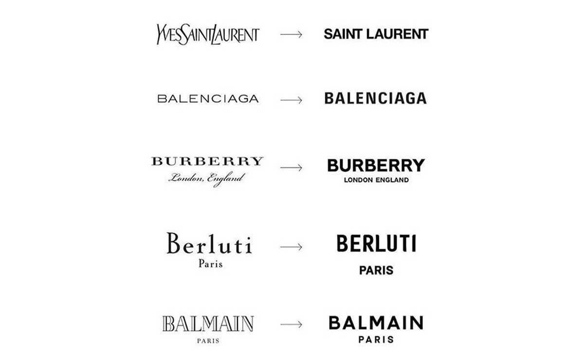
Whether or not this is true, though, it’s no wonder that major brands such as Yves Saint-Laurent, Burberry and Uber have recently rebranded, shifting from complex imagery to minimalist design.
Is Logo Design Dead?
Minimalism is always evolving, but its core elements have remained the same. Clean lines, elementary shapes, simple colours and the least possible amount of ornamentation.
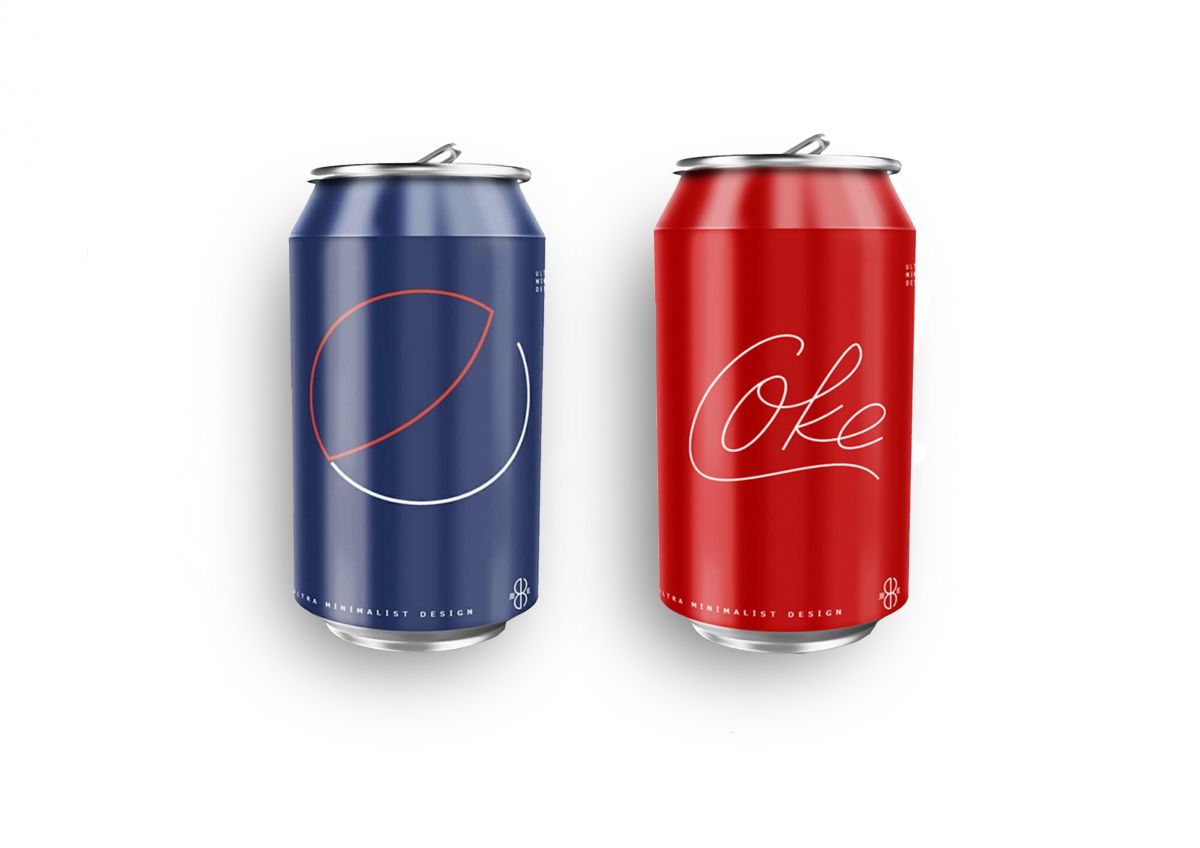
Bilal Koç, a designer from Turkey recently made a splash when he uploaded a collection of famous brand logos side by side with simplified adaptations of the same logos. These adapted logos, some of which can be seen below, included Coke, Pepsi, McDonald’s and Starbucks.
The design community responded with a collective sigh, not because Bilal’s designs weren’t up to scratch or because this seemed like a trivial exercise, but because all of these simplified adaptations seemed perfectly likely to actually happen.
The loss of a brand’s identity, then, seems to be the strongest case against minimalist design in branding. While implementing simplified designs within your branding does ensure consistency, it also ensures that your brand isn’t going to stand out from the crowd.
Mirko Ilic, a New York designer, expressed this opinion when he posted a collection of famous fashion brands’ new logos with the caption:
“Interesting logos are being replaced with boring ones. These are the people who are
destroying respect for graphic design”
Allowing for a Change of Focus?
The counter argument to this is intriguing.
Whereas brands used to set themselves apart with a logo, the rise of minimalist branding means that these same brands now have to differentiate themselves in new and innovative ways.
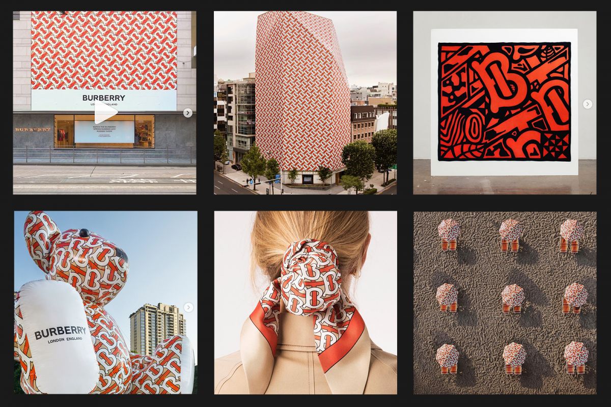
Burberry, for example, jumped on the fashion industry’s minimalist bandwagon in 2018, updating their logo for the first time in 20 years.
While their logo took on a far simpler form, they simultaneously launched a bold and distinctive monogram, designed by iconic graphic designer Peter Saville.
Such innovations are becoming increasingly common as companies look to distinguish themselves from their competition in new ways to compensate for their same-y logos.
It’s a possibility, then, that while many designers are slating this trend for facilitating a lack of creativity, the reality is that it is allowing for increased creativity in other areas of marketing.
In Conclusion...
While there is legitimate concern that this trend of minimalism is leading to a reduction in the level of creativity within the world of branding, it’s important to consider the benefits that it brings.
Having a simplified logo allows for consistent and impactful branding, while also providing scope to focus creative and financial efforts on other, more innovative areas of marketing.
At JBi, we make it a priority to cater to each of our clients’ individual needs. Whether you’re looking for a bold and exciting rebranding or a more minimalist look and feel, we’re ready to help you.
If you are looking for support on your company’s rebranding, or if you have a digital project that you would like to discuss with our team, please don’t hesitate to get in touch at hello@jbidigital.co.uk


