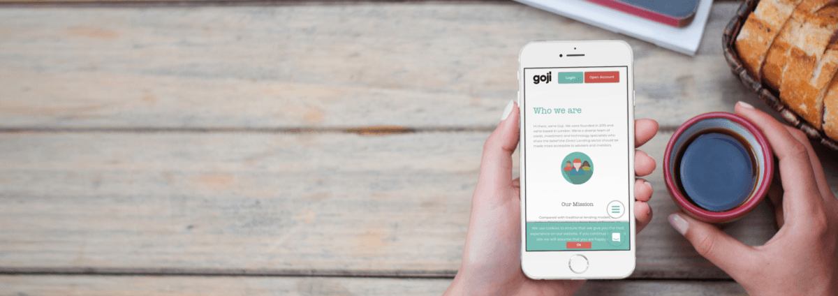
We created a new website for fintech start-up Goji, which reflected their brand whilst communicating with their product-specific user bases via a streamlined UX strategy.


We created a new website for fintech start-up Goji, which reflected their brand whilst communicating with their product-specific user bases via a streamlined UX strategy.
Goji is an investment platform focused on direct, peer-to-peer lending and sustainable investing. What’s more, Goji are building products and tools which they licence to investors, thereby enabling them and borrowers to benefit from it.
Goji came to us a referral from another client, armed with shiny new branding, but a hard to navigate website. We were tasked with reflecting their image in the design of the website and explaining the product to two different user bases: advisors and investors.
The topic is quite complex and we needed to clearly explain this through the design and UX. The key objectives were to reduce the website bounce rate and keep people engaged, so they could be educated on the product and consider investing.


We ran extensive benchmark and competitor research, which we presented to the client. From here, we worked collaboratively to marry the client’s vision with our advice, providing solutions for issues that the client hadn’t considered previously. We focused on a simple navigation, a logical content structure and specific, consistent language, which we communicated through a specially designed icon set in Goji’s new branding, fluid transitions and the creative display of the product’s features.
We worked closely with the client to map the user journeys, which helped to organise the client’s ideas and worked as an education piece around product planning.
Following the benchmark and competitor analysis, we progressed to wireframing. This continued to structure the client’s thinking and underpinned the design strategy.
We workshopped changes to the designs in meetings with the client, where we considered their feedback and worked in real time to make changes, whilst consulting on their ideas throughout. Our designers worked directly with the client to present our ideas and quickly sketch things up as our ideas developed.
To communicate the complex product to visitors to the site, we created infographics showing how different lending opportunities worked, in their branding. These worked really well to explain the complexity of peer-to-peer lending.

Following the initial website redesign, we have established a great relationship and continue to work with Goji to make ongoing updates to the site. Traffic to the website has increased by 22% since launch, whilst organic search has improved by 12.5%.
