
What the best university websites still get wrong
The reviews: six leading university websites
1. Aalto University
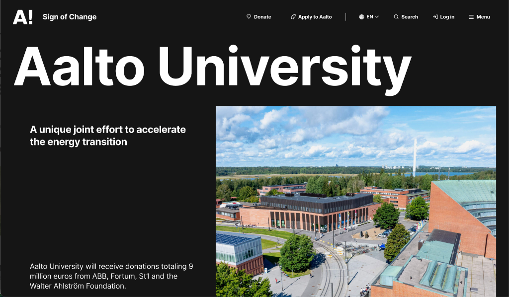
Silktide accessibility score: 98 | Core Web Vitals: Passed on desktop / Failed on mobile
The experience
Of the six sites reviewed, Aalto is the most visually distinctive. A black and white base design lets the photography and illustration stand out, and both are chosen with care. The result feels genuinely contemporary without relying on the standard university imagery of smiling students in lecture halls. Small details are well considered. The 'A!' logo responds when you hover over it, which gives the site a sense of personality that many university websites don't manage to convey at all.
The friction
- Confusing navigation: Menus appear in multiple locations across the site, which creates confusion, particularly on mobile. On some pages, the in-page navigation covers the footer entirely, including on the student guide.
- Buried conversion: Course pages carry a lot of content, and the apply button sits well below the scroll point, meaning prospective students have to work to find the most important action on the page, unless the CTAs change during application season to be more prominent.
- Gated features and bare maps: An AI assistant exists but is available to current students only, so we weren't able to assess it. The campus map is a missed opportunity: it shows building names and coordinates but no photos or descriptions. For a prospective student trying to get a feel for life at Aalto before visiting, that's not enough.
The verdict: Aalto is the most visually distinctive site in this review, and the one most likely to make a prospective student want to go there. Three issues undercut that strong first impression:
- Mobile performance: The site fails on the primary device most prospective students use to research universities. A strong brand impression counts for little if the page doesn't load.
- Navigation: Multiple menus in different locations create confusion, particularly on mobile, where in-section navigation is easy to miss.
- Conversion architecture: Course pages are content-heavy, and the apply link sits well below the fold, making the most important action on the page hard to find.
2. Imperial College London
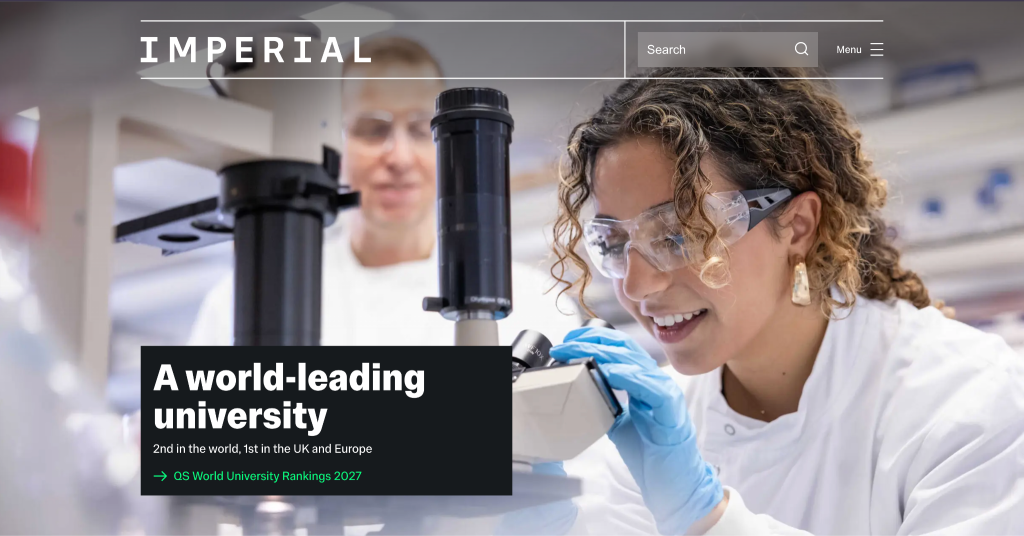
Silktide accessibility score: 93 | Core Web Vitals: Passed on desktop / Failed on mobile
The experience
Imperial's site reflects its reputation: professional, well-structured, and easy to trust. Each page leads with the most important information first and signposts related content early, with detail further down the page. For a prospective student comparing several institutions at once, that's the right approach.
Some features are genuinely well thought through. A student ambassador chat sits directly on course pages, which is a useful and well-placed addition. A course comparison tool works cleanly. The virtual tour adjusts based on the course you're browsing, which shows that someone has considered the prospective student's specific situation rather than offering a one-size-fits-all experience.
The friction
- Deep navigation weakness: The main navigational weakness appears below the top level. Once a user moves into secondary and tertiary menu levels, the structure becomes harder to follow.
- Staged visuals: The photography is polished but staged, which reinforces Imperial's academic standing while creating some distance from the student experience itself. Candid imagery would warm the site without compromising its authority.
- Basic search experience: The application process is easy to find, key dates are clearly signposted, and every course page carries a prompt to apply. However, for a site of this size, the complete absence of suggested pages or predictive results in the search bar is noticeable.
The verdict: Imperial's site is professional, well-structured, and easy to trust. Three areas would improve conversion if addressed:
- Mobile performance: The most urgent issue. A prospective student arriving on a phone will encounter slow load times before they've engaged with anything the site does well.
- Lower-level navigation: Below the top-level menu, the structure becomes harder to follow. Prospective students who move beyond the homepage into course and admissions detail are the most valuable visitors; losing them to navigation confusion is a missed opportunity.
- Warmth: Staged photography and a consistently formal tone keep the site at arm's length from the student experience. Candid imagery and peer content would close that gap without compromising the institution's authority.
3. Royal Academy of Arts
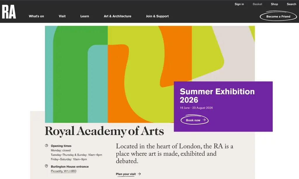
Silktide accessibility score: 92 | Core Web Vitals: Passed on desktop / Failed on mobile
The experience
The RA runs one website for three very different audiences: the general public, school groups, and serious postgraduate art students. Keeping a coherent design across all three is genuinely difficult, and the site manages it. That's worth acknowledging before getting into the areas that need work. The photography, typography, and icons all feel like deliberate choices rather than defaults. The site has a distinct visual point of view.
The friction
- Repetitive layouts: The design system is limited in range, and repetition sets in after a few minutes of browsing. Each audience gets what they need at a surface level, but no single group gets the depth they would find on a site built exclusively for them.
- Noticeable application handover: Applications are processed through an external platform, and the switch is jarring. The RA does its best to prepare users with detailed guidance before they leave the site, but prospective students will still feel the friction of the join.
- Low contrast: On some pages, the contrast between the text and background colour is low enough to make reading uncomfortable, an accessibility issue and a practical hurdle for anyone browsing in poor lighting on a phone.
- No discovery tools: There are no AI-powered features anywhere on the site. For an institution with a significant public art collection and a postgraduate audience actively researching specialist courses, a tool that helps users explore by interest or theme would add real value.
The verdict: The RA does something genuinely difficult: one site, three distinct audiences, a coherent design throughout. That deserves credit. However, three issues affect conversion:
- Mobile performance: A prospective postgraduate student researching on their phone will encounter slow load times before they've engaged with the content.
- External application handover: The RA softens it with detailed guidance, but the join between the main site and the external platform is noticeable and will cause some prospective students to drop off.
- Multi-audience depth: Serving the public, schools, and serious art students from a single site means no single audience gets the depth they might find on a dedicated institution's website.
4. University of Melbourne
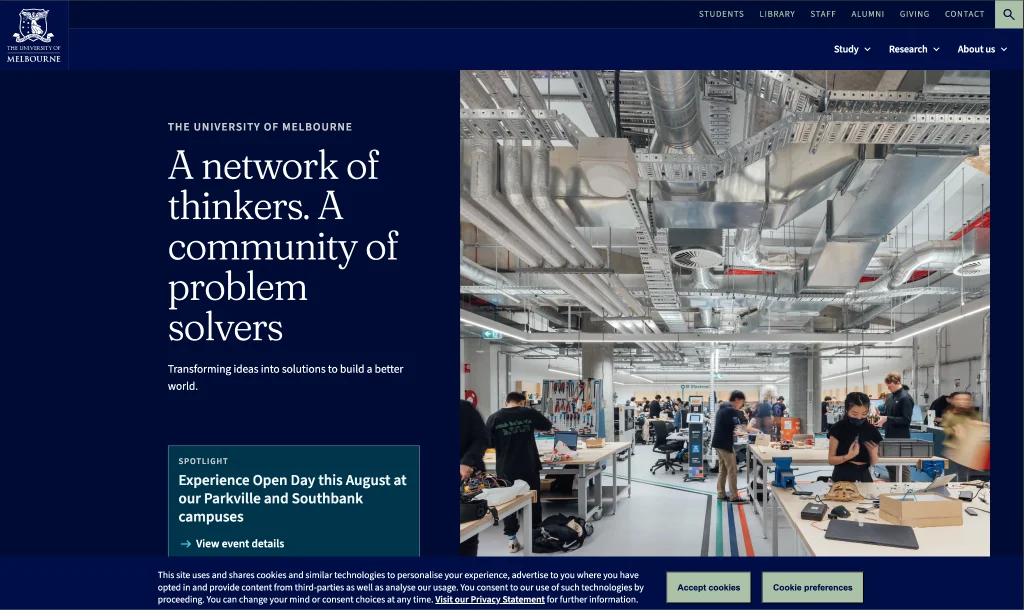
Silktide accessibility score: 80 | Core Web Vitals: Failed on both desktop and mobile
The experience
Melbourne is a world-class institution competing internationally for students, but the website doesn't reflect that ambition. The design is clean and functional, but it makes no attempt to distinguish itself. The site does have genuine strengths, however: the virtual tour is one of the more detailed in this review, self-navigating, with enough depth to give a prospective student a real sense of campus life. A course-saving feature is also in development, suggesting some awareness of what prospective students need when comparing options across multiple visits.
The friction
- Critical SEO errors: The accessibility score of 80 was severely marked down for a missing H1 heading on the homepage. For non-technical readers, an H1 is the main title of a page that search engines use to understand what the content is about. Without it, the page is harder to find and harder to rank. It is also one of the easiest things to fix.
- Broken mobile layouts: Once users move beyond the homepage, navigation consistency breaks down. The apply button sits deep within course pages, requiring too much scrolling. On more complex pages, the mobile layout completely breaks, with menus and headers cut off on smaller screens.
- Stagnant tooling: AI integration is well behind where you would expect it for a global research university. There are no modern discovery tools or digital assistants to help a prospective student navigate a large, complex course catalog.
The verdict: Melbourne's content and virtual tour are solid, but the technical execution is actively working against them. Three issues are costing the institution prospective students:
- SEO foundations: A missing H1 on the homepage is a basic error that no institution competing internationally for students should have. It leaves the page harder to find and harder to rank.
- Core Web Vitals: Failures on both desktop and mobile mean pages load too slowly and the site breaks on smaller screens. These are not cosmetic issues; they directly affect how many prospective students stay long enough to consider applying.
- Mobile responsiveness: The design breaks on more complex pages, with the course menu and some headers cut off on smaller screens. For an audience doing their first research on a phone, that's a significant barrier.
5. MIT
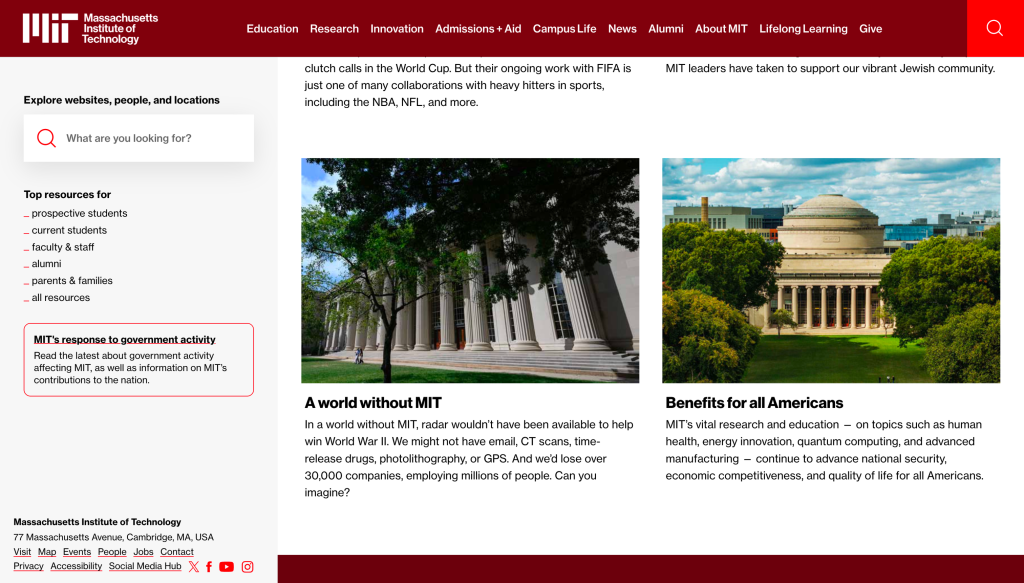
Silktide accessibility score: 95 | Core Web Vitals: Passed on desktop / Failed on mobile
The experience
MIT's site hasn't had a significant redesign since 2017, and against the other institutions in this review, that shows. However, grid layouts and annotations nod to the university's scientific identity, which gives the site personality even within an older design framework. Student-created content appears across the housing and admissions sections; prospective students trust peer voices more than institutional ones, and MIT uses that effectively.
The friction
- Bloated admissions funnel: The admissions journey has far too many steps: main menu, admissions landing, admissions site, application page, application type selection, and registration. That's five clicks before a form even appears. Each step is a point where a prospective student can lose confidence or attention.
- Fragmented sub-domains: Sub-domains for different schools lack central design management. For example, the School of Humanities, Arts and Social Sciences looks completely unrelated to the main MIT site. A user who lands there from search may not feel confident they are in the right place.
- Forced landing pages: Top-level navigation splits cleanly by user group, which is sensible. However, the main navigation has no dropdown menus, meaning task-oriented users who know exactly what they want are forced through an interstitial landing page before they can reach it.
The verdict: MIT's reputation carries the site further than the design deserves. Three key issues are costing the institution applicants:
- Mobile performance: A prospective student arriving from search on a mobile device will encounter slow load times before they've read a single word.
- The admissions journey: Five clicks before a form appears is four too many for an audience with other options open in adjacent tabs.
- Sub-domain inconsistency: A student who lands on the School of Humanities site from a search result may not recognise it as part of MIT at all.
6. TU Delft
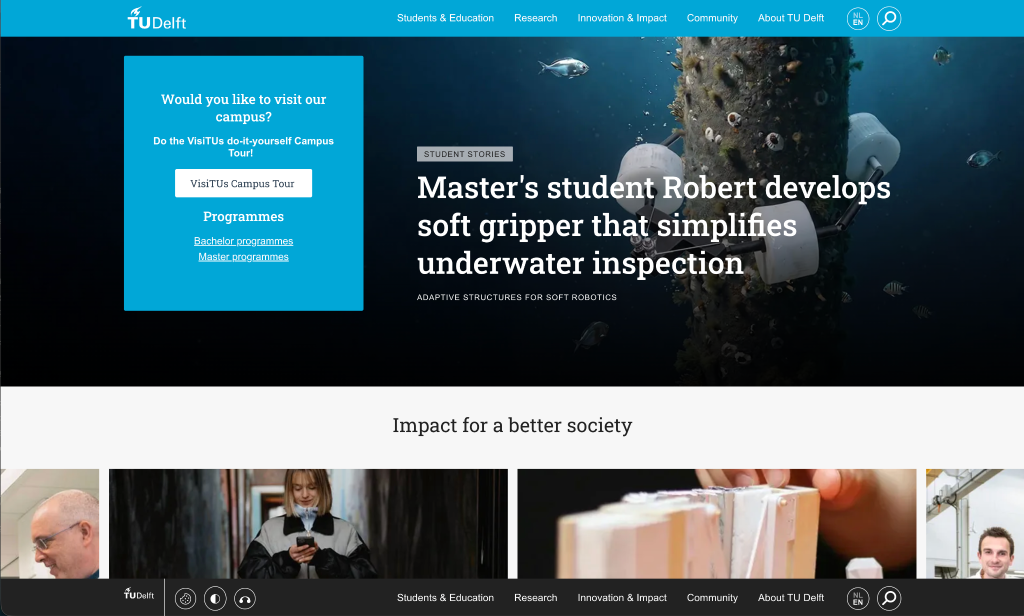
Silktide accessibility score: 91 | Core Web Vitals: Failed on both desktop and mobile
The experience
For a university whose entire reputation is built on technology and design, TU Delft's website is a surprising result. The layout feels heavy and dated, dominated by generic stock photography that works against active recruitment. The newer sections of the site, Campus and Research Stories, look noticeably more modern than the main domain, but the overall experience is disjointed.
The friction
- Severe accessibility issues: The contrast between the main brand blue and white text is too low across every page on the site. This makes text harder to read for all users, and particularly difficult for those with visual impairments. The accessibility overlays currently in place address the symptom without fixing this underlying domain-wide colour problem.
- Obstructed conversion paths: Finding the application process takes significant effort. A prospective student must click through four separate levels of navigation before reaching any application guidance. Every additional click invites abandonment.
- Poor technical performance: Pages load slowly on both desktop and mobile, with mobile being the more pressing concern given the target demographic's habits.
The verdict: For a university whose reputation is built on technology and design, the website undersells the institution at every level. Three issues stand out:
- Mobile performance: Pages load slowly across the board. High-friction load times on mobile directly disrupt initial user research.
- Accessibility failures: Low contrast between the main brand blue and white text affects every page on the site. This needs fixing at source, not patching with superficial overlays.
- Application journey: A prospective student must click through four separate levels of navigation before reaching application guidance. Every additional click is a point at which someone will give up.
Frequently asked questions
A good university website does three things well: It loads quickly on mobile, where most prospective students do their first research. It makes the application process easy to find and complete. And it communicates the character of the institution clearly enough that a prospective student builds an emotional connection before speaking to anyone. Weakness in any one of these areas directly costs applications.
The most widely used tool for automated accessibility testing is Silktide, which scores pages against WCAG 2.1 AA. Google Lighthouse, built into Chrome's developer tools, also provides a free accessibility audit. These tools flag structural issues such as missing headings, low color contrast, and images without descriptive text. They identify the most common and most fixable problems quickly, though they don't replace manual usability testing.
WCAG stands for Web Content Accessibility Guidelines. Version 2.1 AA is the standard most organizations are expected to meet. It covers a range of requirements designed to make websites usable by people with visual, auditory, motor, and cognitive impairments. In the UK, public sector organizations including universities are legally required to meet this standard under the Public Sector Bodies Accessibility Regulations 2018.
Core Web Vitals are a set of performance measures used by Google to assess how well a webpage loads and responds to user interaction. They cover load speed, visual stability, and how quickly a page responds to the first user action. Google uses these scores as a critical ranking signal, meaning a site that performs poorly on Core Web Vitals is highly likely to rank lower in search results than a faster competitor.
Aalto University scored highest on accessibility (98 out of 100 via Silktide) and was the strongest overall on design and brand expression. Imperial College London was the most structured for prospective student journeys, with a clear application funnel and well-placed conversion prompts throughout. No single site excelled across all areas, and every site in the review failed mobile performance tests.
Similar Reads
Our latest news articles featuring company insights and what we have achieved so far



Digital transformation. Delivered securely.
Let’s discuss your objectives.