
Google gets a new logo
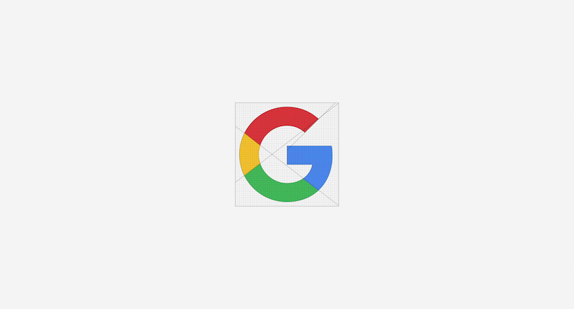
Today, Google announced a brand new logo, replacing their colourful serif logo they’ve been using since 1999 (if we get the minor tweaks it has had since then) with an equally colourful sans-serif logo.
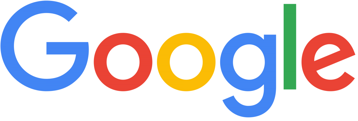
The new logo plays well with Google’s parent company – Alphabet’s own design language, which helps unites the brands. Google has said the new design will be rolled out across all their products and brands in the short-term but the new logo has already debuted on their homepage .
But why the change? Google tells us in a blog post that technology has changed how we interact with their products and the internet in general. The new logo better reflects the fact Google is no longer a site you visit on just one device for one purpose. So making the new logo look good on all screen sizes was a major consideration, bolder lettering certainly makes it stand out at any size.
Similar Reads
Our latest news articles featuring company insights and what we have achieved so far



Digital transformation. Delivered securely.
Let’s discuss your objectives.