Quick Wins: How to begin making your website accessible

If you’ve just begun your journey to improving the accessibility of your website, it may seem daunting, but accessibility is important.
You can get an idea of how big a task you have ahead of you by trying to use the website without a mouse, or by closing your eyes and relying on a screen reader to guide you through. This will give you insight into how a user with a disability might perceive your website.
Where should you start?
Some of the issues that you identify will likely need development to fix, but others can be resolved by people within your business. We have put together a list of easy ways you can begin to improve the accessibility of your website.
Images and Videos
Alt Text
Alt text is an alternative for image-based content for people with visual disabilities who use a screen reader. This means that their computer will read a description of an image to them.
It is important to use the right alt text on images. Unnecessary alt text can be jarring, as the flow of content will be interrupted.
- Images that convey meaning and context to the content should have short (no more than 100 characters), and accurate alt text.
- Do not include phrases such as “image of” or “graphic of”.
- Decorative images should have alt text set to null (“”) so the screen reader will skip past them.
- Tip: most images on web pages are decorative. This means they don’t add any new meaning to the webpage.
Images with text
Never use an image in place of text and avoid using images containing text. If you have to use an image with text, ensure that the text on the image is transcribed in the alt text, or is available as part of the body copy.
If the alt text is more than 125 characters, you are probably better off not using the image, and writing the content in the body copy. Many screen readers will cut off alt text at 125 characters so try to limit it to below 100 characters.
Videos
Audio content needs a transcript or subtitles to be provided to give hard-of-hearing users an alternative to the audio and ensure no meaning is lost for them.
Tip: if you embed videos onto your site using YouTube or Vimeo, they often auto-generate captions if you select the correct settings.
PDFs
PDFs hosted on your site must also be accessible. You must ensure that all images have the correct alt-text and that the content flow is logical for screen readers and those who navigate via keyboard. You can manually check a PDF, or use automated tools such as Acrobat Pro’s built-in checker. In fact, Acrobat is now using AI to help with PDF remediation.
The general consensus is moving away from using PDFs. The GDS now suggests using an HTML page instead of PDFs.
Writing in an accessible way
Directional Language
Never use directional language in web copy, such as:
- Click here
- The table below
- See to the right
- Click the blue button
Users with visual impairments will not be able to find information based on these prompts.
Ellipses
Avoid using ellipses where possible. Different screen readers may interpret how an ellipsis is read to the end user, and it could disrupt the flow of text. There are also different contexts where an ellipsis can be used – it could be omitted text or a pause in thought, just to name a few. For those with cognitive disabilities, it may be hard to define the context it is used in.
Page Structure
Your page structure should have a clear hierarchy. You should use headings to convey structure and meaning.
- Heading one (H1) should only be used for the page title.
- Heading two (H2) should be used for subsections.
- Heading three (H3) should be used for sections within subsections.
Screen readers rely on this structure to deliver content to the user. It’s important not to skip levels as users may think they’ve missed content. Having clearly structured content also helps search engines read your page, improving SEO.
Plain English
Writing in Plain English benefits all users, as it is clearer and easier to read and means messages are conveyed more powerfully. To write in Plain English:
- Keep your sentences short.
- Don’t use jargon.
- Use active verbs.
- Use words that are appropriate for the context.
View the GDS guidance on writing for the web.
Links
Hyperlinks
Never insert the URL for a website or document/PDF without hyperlinking it. The link text should describe the link and where it is going.
Directional Language and Links
Avoid language such as ‘find out more’ or ‘click here’ – when navigating the webpage via links, the screen reader will see a list of links which don’t give the user any idea of where the link goes.
Example of How to incorporate a link
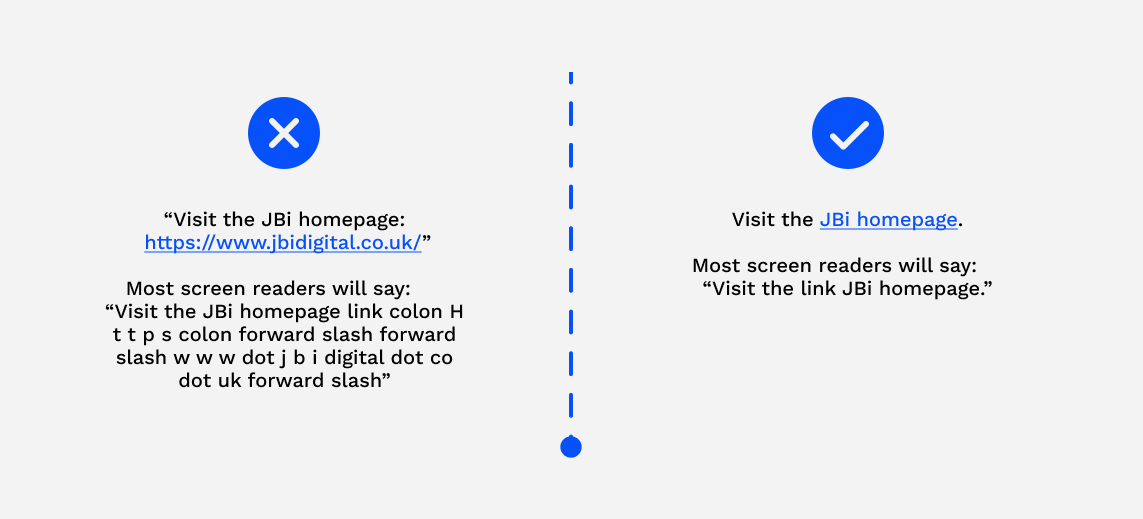
If you add the link into your text like so, “Visit the JBi homepage: https://www.jbidigital.co.uk/”, most screen readers will say: “Visit the JBi homepage link colon H t t p s colon forward slash forward slash w w w dot j b i digital dot co dot uk forward slash” – which isn’t a great experience for the user.
But, if you hyperlink the text like so, “Visit the JBi homepage.” most screen readers will say “Visit the link JBi Homepage.”
Tip: there may be some security concerns over hyperlinking as opposed to inserting a raw URL. For regular users, it is recommended they always hover over a hyperlink to check the link destination is secure. For users navigating with a screen reader, they can set their configurations to read out the full URL if necessary.
Opens in a new tab
It’s best practice not to open links in a new tab. This is because it can:
- be disorientating for users with a cognitive disability
- create navigation issues for those using a screen reader
It’s also important to create a consistent user experience across your site. If there is a good reason a new tab is needed, you should inform users of this so they know what to expect. This can be done using a favicon (an icon associated with that website) next to the hyperlink, or by writing (opens in a new tab).
Third-Party Integrations
Whether you developed it or not, you are responsible for making sure everything that appears on your website is up to standard; This includes any third-party integrations or embedded content. It is a good idea to review your current software and see if any need replacing.
Forms
Forms are one of the trickiest things to get right from an accessibility perspective. Here are a few things to consider:
- Add help text explaining how many options need to be selected in a question. For example, ‘Select all that apply’ or “Select one answer”.
- Ensure that the question is clearly associated with the answer field, so the screen reader reads the question in a logical order.
- Consider how your form will scale so that users can enter the information they need on smaller screen sizes too.
Looking to further improve your accessibility?
If you would like more assistance, look no further. JBi has extensive experience auditing, improving, and redesigning websites to meet accessibility standards.
Talk to us about taking your next steps towards accessibility by emailing hello@jbidigital.co.uk or calling 0207 043 2510.
