JBi’s Favourite Accessible Websites
The websites below show that accessible design doesn’t require sacrificing visual interest. Each one demonstrates how good accessibility and strong design can coexist.
1. Scope
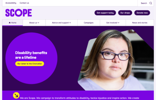
Disability equality charity Scope practises what it preaches.
Its website is a good example of what accessible web design looks like. The link to the Accessibility page is always visible above the menu, and when you tab into the site, it immediately gives you options to go straight to ‘main content’, ‘search’ or ‘navigation’. For a user navigating by keyboard or screen reader, that’s a significant timesaver: they can skip straight to what they came for, rather than working through every navigation element on the page.
Scope is easily the most colourful example on our list. By choosing bright colours with high contrast, they bring personality to the design without compromising on accessibility.
2. The Met Office
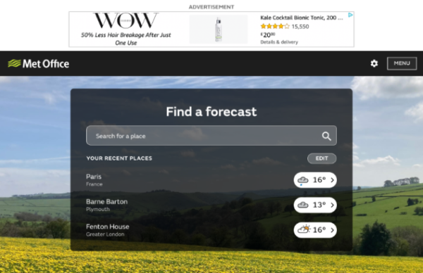
As a public sector body, the Met Office is legally obliged to maintain an accessible website. Given the volume of weather images, icons and videos on the site, that was no small task.
Using alt text, overlays and closed captions, they’ve maximised the use of visuals without excluding users who are blind or have visual impairments. Everyone can see, read, or hear the weather near them.
3. LinkedIn
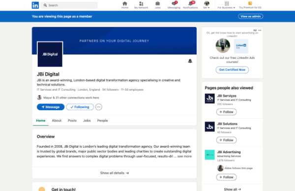
Considering the volume of content and functionality on LinkedIn’s website, its accessibility record is better than you might expect. Some imagery carries confusing alt-text descriptions, and user-generated content creates inevitable colour contrast and legibility issues.
The core product performs well. The focus order is logical, LinkedIn gives users the option to skip past each post in the news feed rather than tab through it in full, and the majority of its interface meets WCAG criteria.
4. Barclays
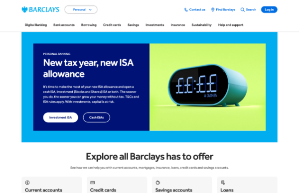
Bold and blue. Barclays manages to get plenty of personality into its website while meeting accessibility success criteria.
Tailored support across key touchpoints. Skip points are clear, form feedback is descriptive, and alt text is useful. These are small details, but they make a material difference to users with disabilities.
5. BBC
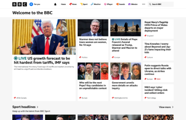
The BBC’s commitment to providing an accessible experience is evident throughout its website.
As well as a ‘Skip to content’ option, they provide users with the opportunity to go straight to their ‘Accessibility Help’ page which has useful links and resources to help them get the most out of their visit.
On top of that, they have written text links and media descriptions to provide audio and video alternatives to ensure all users have access to the same content.
6. Airbnb
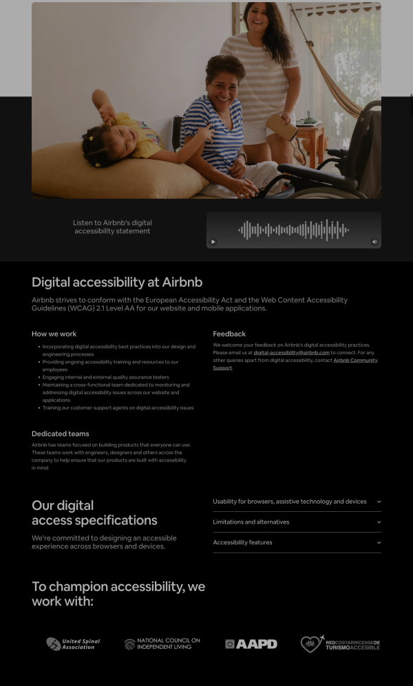
Airbnb is a strong example of a company that listened and invested in making its platform more accessible. From the mid-to-late 2010s, it faced significant criticism: a design-heavy build that fell short of accessibility standards and proved difficult to fix through piecemeal retrofitting.
That changed when the issue was given serious focus, budget, and dedicated resources. The results are visible to users. A blind user can now complete a booking end to end using only a keyboard. Pop-up windows and overlays no longer trap focus, meaning users don’t get stuck and can’t find their way out. Interactive elements are consistently labelled in a way that screen readers can interpret correctly. And accessible design is now built into how Airbnb develops new features, so improvements don’t have to be retrofitted after the fact.
Some areas, particularly host-side tools and the mobile web experience, still have room to improve. Given the scale of their investment and the measurable progress they’ve made, Airbnb earns a place on our accessible list.
7. Gov.UK
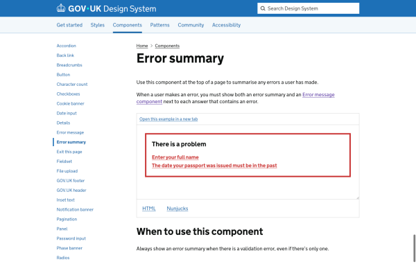
If there is one website that accessibility practitioners point to more than any other, it is GOV.UK. As the central platform for UK government information and services, it is used by millions of people who often have no alternative.
GOV.UK is notable for the quality of its output and the openness of its approach. The Government Digital Service publishes its design standards openly, so other organisations can adopt the same accessible patterns. It meets the accessibility standard required of public sector bodies and has carried out extensive research with disabled users to make sure the guidance is grounded in how people actually use the site.
Some legacy and locally-managed services fall short of the central standards, but as a model for accessibility at scale, GOV.UK remains the benchmark.
Inaccessible Websites
In contrast to the examples above, the following websites’ accessibility leaves much to be desired. Looking through the list will highlight common issues, so you know what to avoid. See where you run into issues.
1. Sketch

You cannot navigate the Sketch homepage without a mouse. Keyboard users can’t access the menu at all, which fails the most basic accessibility test.
2. Instagram
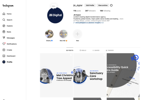
User-generated content creates inherent accessibility problems. Instagram left users responsible for inputting alt text and managing colour contrast in stories. Predictably, the result is widespread inaccessible content.
Facebook and TikTok face comparable problems for the same reasons.
3. SoundCloud
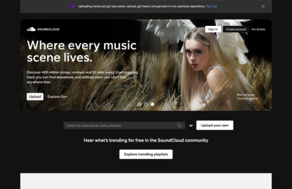
Barely perceivable focus states, poor colour contrast and a missing ‘skip to content’ link are among the problems on SoundCloud’s website. Getting stuck in keyboard loops is a more likely outcome than finding new music.
For a company built around sound and music, the lack of consideration for users who rely on screen readers is a notable oversight.
4. Lings Cars Museum
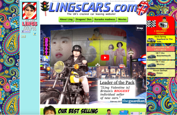
When Ling founded her business in 2000, she deliberately designed a ‘bad’ website as a marketing stunt to stand out in the car rental market. With bright patterns, eye-catching animations and a karaoke section, she certainly achieved that goal.
She also created an unintentionally perfect example of an inaccessible website. Non-descriptive link text, auto-playing videos and poor colour contrast are just a few of the WCAG violations.
Ling recently updated her website to a much more conventional (and accessible) version. But the old site is still available as a museum to her vision and we encourage you to take a look around.
One warning: it contains a great deal of animation and flashing, far more than WCAG allows. The threshold is fewer than 3 flashes per second, ideally with the option to disable them entirely.
5. Smyths Toys
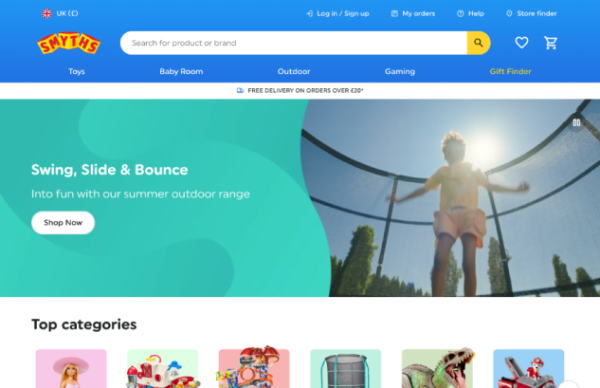
No keyboard access to the mega menu isn’t a great start, but it’s made worse by the white and light blue colour scheme and several buttons with the same, non-descriptive ‘shop now’ text. All of which add up to the fact that Smthys Toys is not a good accessibility introduction for the next generation.
We challenge you to try and use their gift finder with only your keyboard.
Some examples are a little extreme, but we hope this list gives you a clearer understanding of the most common accessibility pitfalls and their real-world impacts on usability.
6. Ticketmaster
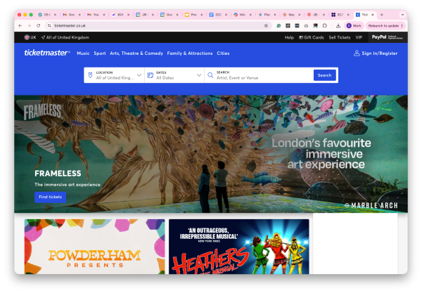
Ticketmaster is one of the most frequently cited examples of accessibility done poorly. Its problems are well-documented and persistent.
Users relying on assistive technology regularly encounter:
- Keyboard traps during checkout: users can get stuck on a step and can’t move forward or back without a mouse, making it impossible for some people to complete a purchase
- Time-limited ticket holds that expire before screen reader users have had enough time to complete the necessary steps
- Security checks that have no accessible alternative, effectively blocking entry to some users entirely
The context matters. Buying concert and event tickets is a cultural and social activity, and inaccessible design excludes disabled people from that participation. It’s also commercially short-sighted: disabled people in the UK have a combined spending power estimated at over £274 billion. Despite its scale and resources, sustained improvement has been slow. Ticketmaster remains a cautionary example of what happens when accessibility is treated as an afterthought on a high-stakes transactional site.
7. News websites
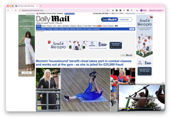
Inaccessibility is widespread across the news publishing industry, so we’re naming the category rather than one offender.
Many news websites, particularly those running large volumes of advertising, consistently perform poorly for users with disabilities. Common problems include:
- Cookie consent banners and subscription pop-ups that block keyboard users from reaching the content until they’re dismissed
- Auto-playing video and audio with no easy way to pause or mute, which is disruptive for users relying on screen readers or those with cognitive disabilities
- Dynamically loaded content that doesn’t notify assistive technology when new articles have appeared, leaving screen reader users in the dark
- Poor colour contrast in body text and captions, particularly on sites where brand styling takes precedence over readability
- Missing or inconsistent heading structures, which makes it slow and difficult to navigate an article by screen reader
News sites carry some of the most important public interest content on the web. The people most likely to be excluded by these failures are often those who most need reliable access to information. The business pressures around advertising and subscriptions are real, but they don’t justify designs that routinely fail accessibility standards at the most basic level.
If you want to ensure you aren’t falling into any of the pitfalls above, talk to our accessibility experts by emailing hello@jbidigital.co.uk or calling 0207 043 2510 to organise an audit of your website.


