Coca-Cola is one of the most powerful brands worldwide. What has helped them achieve international recognition is their awareness of the events surrounding them.
Everyone is familiar with the Coca-Cola Polar Bears and the TV advert with the Santa Claus truck, programming the audience to know that the Christmas holidays are just around the corner. This is how their brand is strengthened every year, making their consumers aware that they are taking part in a common event.
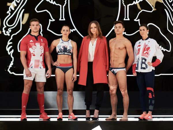
Coca-Cola prepares for the 2012 Olympics
With the 2012 Olympic Games coming up, the Coca-Cola website has been rebranded to prepare for the event. Here is a break down of the features that are on their website design.
1. Header
The header contains the Coca-Cola logo, followed by branding which portrays the Olympic games. A vector image of the iconic olympic torch is placed, which has been designed using negative spacing. The orange makes it stand out from the typical red and white colours that we’re used to seeing. All this is followed by a Twitter button to follow the company, as well as a search function, and language options. One key feature that has recently become a big deal is the “How We Use Cookies” button, highlighted in red. From this point it is already clear that the colour red is what is used to attract visitors to important banners and buttons.
2. Navigation
Coca-cola has decided to stick with the general navigation design, and with good reason. With a vibrant read background the size can remain thin and stay out of the way of the content underneath. When highlighted, there is a drop down menu with a grey-pink background.
3. Rotating Banner
As the website has been rebranded to prepare for the olympics, the most important content that correlates with the event is the first thing that is seen. Within the banner is a semi-transparent box containing a catchy headline and synopsis of the story.
Any web agency in London would use a rotating banner to set the tone of the companies message, which is exactly what Coca-Cola has done. Each featured headline either tells a story about the olympic games, health, or the environment. Overall they are trying to say, “we’re current, we’re healthy, and we’re caring”.
4. Widgets
Underneath the banner is a selection of widgets that direct the user to other pages within the current site. This includes; the Coca-Cola Blog, the latest news from the Environmental section, the latest article from the StreetGames section, the latest article regarding the Olympic Games, most viewed pages, and FAQs.
These are less dominant than the rotating banner, but they are still important to get traffic moving throughout the website.
5. Side Panel
The side panel lets users browse the brands of the company in a designated widget, with the option to find out more. There is also the chance to vote on a poll, take a consumer survey, or get in touch. This finishes all the content found on the main body.
6. Footer
The footer is fairly simple when compared to the rest of the homepage. It is made up of mostly a plain white background, with an image that helps finalise the olympic branding.
