
4 hours and 37 minutes per day. According to recent data that’s how long the average person spends looking at their phone. That equates to 1 day per week, 6 days per month, or 70 days per year. That’s a lot of time!
Gone are the days when desktops dominated online experiences; now, with smartphones in almost everyone’s hands, phones are the primary gateway to the internet. By the end of 2024, 98% of global users accessed the internet via mobile phones, while only 58.3% did so through laptops or desktop computers.
This shift makes it essential to rethink design strategies, placing mobile-first design principles at the core of all UI projects.

The Traditional Approach to Web Design
Historically, web design has followed a desktop-first methodology. Designers create websites optimised for large screens, filled with features and complex layouts. Mobile versions are often an afterthought, stripped-down adaptations that lead to inconsistent user experiences, where some features simply don’t work.
This approach, known as “graceful degradation”, focuses on ensuring that a robust desktop experience can still function on smaller screens, but it doesn’t truly cater to the needs of mobile users.
The Shift to Mobile-First Design
Mobile-first design turns this traditional approach on its head. Instead of designing for desktops first and scaling down, as its name suggests, mobile-first design starts with the mobile experience and progressively enhances the design for larger screens.
This approach, called “progressive enhancement”, ensures that core functionality and content remain accessible across all devices, with additional features layered in for larger screens.
Mobile-First Design at JBi
At JBi, we recognised the shift towards mobile usage and fully embraced mobile-first practices to deliver the best possible experiences for clients and their users. From a user’s perspective, our mobile-first approach offers:
- Simplified Interfaces: Designing for smaller screens forces a focus on essential content, leading to cleaner, more intuitive layouts.
- Improved Readability: Larger fonts and better spacing improve readability, benefiting all users. This is a great example of when accessible design inadvertently helps everyone. To learn more about how accessible design benefits everyone, read our blog ‘Accessibility is good for all”
- Faster Loading Times: Encouraging optimisation by removing unnecessary content or design elements, ensures quicker load speeds, especially on mobile networks. Doing so makes information easier to access for users on a wide variety of mobile networks with varying capabilities.
Each factor plays a crucial role in shaping how users experience a website and, ultimately, how they perceive the brand behind it. For an e-commerce business, an optimised user experience can be the difference between a sale, or an abandoned basket.
These benefits aren’t just for users. When implemented correctly, mobile-first design also provides tangible advantages for our clients:
- Better Accessibility & SEO: Mobile-optimised sites rank higher in search engine results, leading to increased traffic.
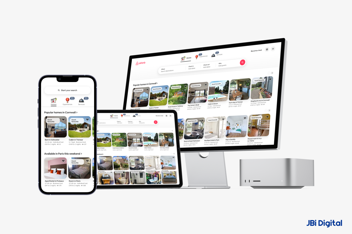
- Higher Engagement & Conversions: Seamless mobile experiences encourage users to stay, and interact with more content. Airbnb for example, utilises mobile first very well. Their mobile and desktop websites are essentially the same, with only the most important content being displayed on both, making the journey from discovery to booking as simple as possible.
- Future-Proofing Your Website: Designing for mobile-first ensures adaptability across evolving device trends. Foldable phones are commonplace now-adays. Therefore, aspect ratios of screens are changing. Mobile first design gives you the best chance of keeping websites optimised for evolving screen shapes and sizes, by reducing unnecessary content and keeping pages responsive.
Mobile-first design is a win-win for both our clients and their users.
Key Principles of Mobile-First Design
To truly leverage the benefits of mobile-first design, you need to understand the foundational principles. Mobile-first design is not solely about fitting content you’re planning to use on desktop into a smaller frame and making it look as good as possible (although this should still be a goal!). It’s about adjusting your approach to give mobile users the best possible experience. Key principles our design team follows, and recommends, include:
- Prioritising Content: With limited screen space, focus on delivering the most relevant information clearly and concisely.
- Simplifying Navigation: Mobile-first design demands intuitive, touch-friendly navigation that enhances usability.
- Optimising Performance: Mobile first design can go beyond the aesthetics of the page. Fast-loading sites are crucial for mobile users, so optimising images, code, and scripts is key.
Best Practices and Potential Challenges
At JBi, we follow a set of best practices and utilise a few essential techniques to meet these principles:
- Responsive Design: Using flexible grids and responsive component design ensures content adapts seamlessly to different screen sizes.
- Touch-Friendly Elements: Remember, users interact with phones differently from desktops. Designing tap-friendly buttons and interactive components enhances the mobile experience and aligns with instinctive behaviour.
- Thorough Testing: Regular testing across multiple devices, browsers and screen sizes ensures consistent performance and functionality.
That said, adopting a mobile-first approach can still present challenges.
- Design Constraints: Starting with mobile may limit complex desktop features, requiring careful balancing of functionality across devices.
- Resource Allocation: Ensuring a seamless experience across all screen sizes requires additional planning and testing.
We understand it can seem like a daunting task. There’s a lot to take in, and it can take a while to truly understand the correct approach to mobile-first design. That’s why our team of talented UI and UX experts are here to help.
Mobile-first design is no longer optional. It’s essential in today’s mobile-driven world. By prioritising mobile experiences, our team creates seamless, engaging interactions that cater to modern users. At JBi Digital, we specialise in implementing mobile-first design strategies that elevate digital experiences and drive real results.
If you’re looking to future-proof your website and create user-friendly, high-performing interfaces, reach out to our team by emailing hello@jbidigital.co.uk. Let’s make your next UI project a success.
