Five essential Photoshop tools for web designers
As a professional website designer it is important to know your tools of the trade. Every designer is different of course, there’s probably over a hundred methods to doing the simplest of tasks in Adobe Photoshop (and Illustrator for some). Even though methods are different depending on the user, they mostly have the same outcome. As you know, JBi is a professional web design agency in London, so it’s only natural that we’ll know the best tools and their advantages. Here are our favourites!
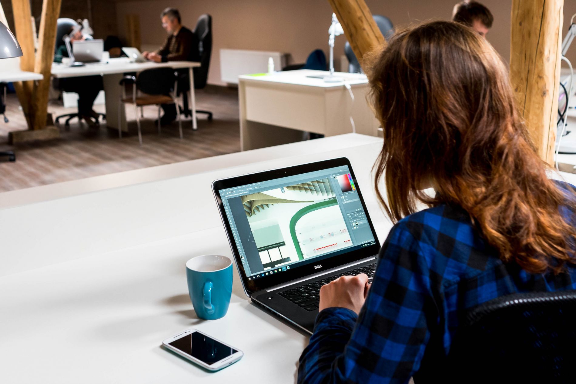
JBi’s Essential Tools for Website Design
Ruler (Ctrl/Cmd + R)
This is the first tool that I personally use. Before you even start drawing out any frames, headers, footers, buttons etc, it’s helpful to mark out the positions of the content on your page. This will make life a lot easier at later stages, and the “snap to” function will place your layers in line with the guides automatically.
Rounded Rectangle Tool (U)
According to the current web design trends rounded corners are preferred to sharp, right angles. Unless you’re designing a corporate website, rounded rectangles are probably the option that your client will prefer, don’t overdo it though or it might just look odd. A pixel radius of about 10-15 px normally does it. For a more business orientated website, around 5 px will do
Vector Mask
When you draw any vector shape, Photoshop allows you to use it as a vector mask. This means that any image applied to it, is only visible within that shape. This has a huge advantage when you want to show just a section of an image or screenshot, without deleting or erasing anything permanently. The image can even be moved around without affecting the position of the layer, just click on the link icon in the layer palette, and select the image (be careful not to select the mask), then drag using the Move Tool (V).
Drop Shadow (blending options)
This is probably my favourite tool in Photoshop. If used correctly this brings a depth to your design that can really give your website design a much needed “lift”, especially to any buttons, widgets, and logos. Don’t go crazy with it though, because it can be more of a nuisance to the eyes if not used properly. The ideal settings are; distance= 0, size= 8, and opacity= 35. Basically, “if you can see it well, it’s too much”.
BONUS: Content Aware Fill
This might not necessarily have anything to do with website design, but it’s pretty cool. Sometimes you might have accidentally joined a layer with the background of your work. This can be such a nuisance because you end up having to start again essentially. Let’s say some text has been joined to a patterned background. All you need to do is select the unwanted section, with any lasso tool, and press the magic keys, shift + backspace. You can simply just press enter/OK and proceed. There you have it! Your background is good as new.
