
What needed changing?
Slack Technology’s messaging service was established back in 2014, and has gone from strength to strength over the last five years.
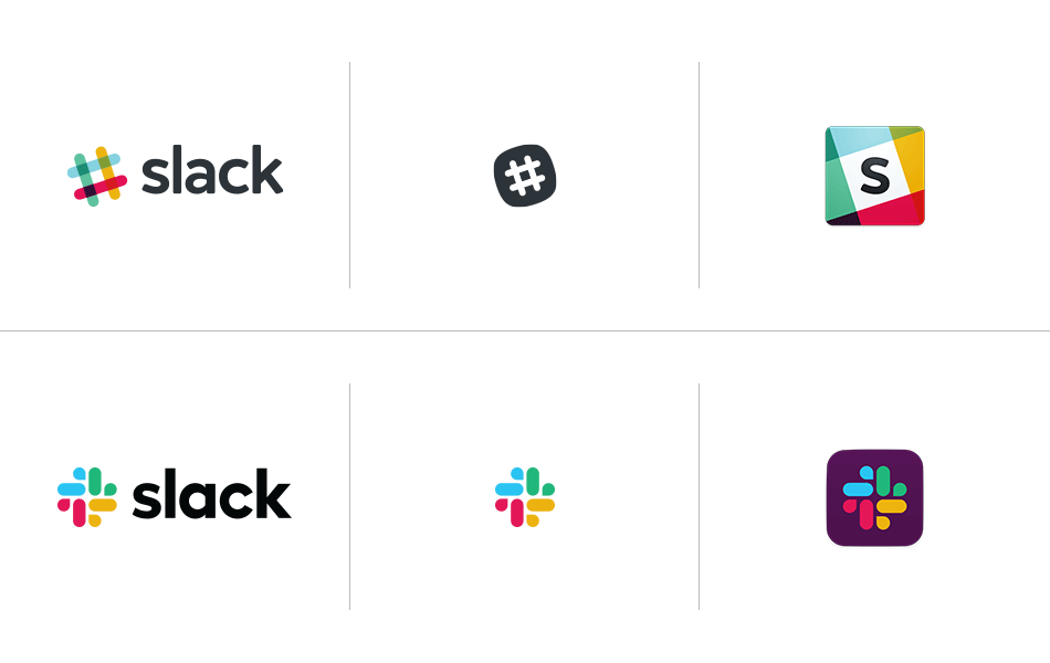
On its launch, Slack adopted an initial logo based on “the octothorpe” (or “the hashtag” to us laymens). The use of this shape in its branding made sense; Slack channels are headed by hashtags, and the hashtag symbol appears across the platform.
Ever since, though, Slack’s marketing team has encountered a series of issues with its initial branding.
For a start, the hashtag has evolved into an eminent and iconic symbol across online platforms, used extensively by social media giants including Facebook, Twitter, Instagram and LinkedIn. With every major website that has adopted the hashtag over the years, Slack’s “octothorpe” logo has become a weaker and weaker representation of its service.
There were a myriad of other issues with the initial branding, including a horrific colour palette and a wide range of contrasting logos across different platforms. Consistency was difficult to find; any variation on the precise 18 degree rotation of Slack’s hashtag resulted in a poor representation.
The list goes on, but we won’t bore you with the details; you can read about them here if you really want to.
Slack’s example is not a one off; start-ups often get stuck with their initial branding for years, no matter how ineffective that branding may be. One high profile example is Uber, whose initial branding wouldn’t have looked out of place if it were representing a supermarket.
Last year, Uber rebranded, putting together a much simpler, more minimalistic look and feel.
Slack has therefore walked a well-trodden path by moving away from its initial branding and towards something simpler and more distinctive.
What’s the backlash about, then?
Is The Backlash Justified?
Now we come to the crux of the matter; has Slack’s rebranding been successful, and is the negative response justified?
The internet is awash with criticism of the rebranding, but that does not necessarily mean that it has been unsuccessful. When popular brands restyle themselves, there is often a negative initial reaction, which dies down over time.
As Michael Bierut, a partner at Pentagram (who supported Slack in the development of its new branding), said to Design Week in January:
“With products like Slack, which are so ingrained in people’s lives, changing the branding is bound to cause dissonance and backlash. Slack was completely prepared for this and anticipated that 95% of its audience would hate the change because they love Slack so much.”
The most important factor in assessing a rebranding should therefore be the quality of the new brand and the extent to which it resolves the issues that it set out to resolve. It is prudent to ignore the initial response, and judge the rebranding on its merits.
So let’s do just that.
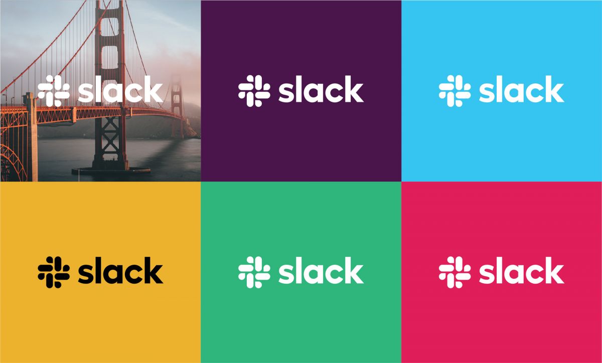
If we assess Slack’s rebranding based solely on the criteria raised by Slack themselves, then it has been a resounding success. The 18 degree rotation has been done away with, leaving a distinctive “octothorpe” based logo which can and has been applied across all platforms. This change has brought more consistency to the brand, which was a key objective from the beginning.
In addition, where the previous logo was composed of eleven different colours, the new logo only uses four, giving Slack a much clearer and more distinctive brand identity. What’s not to like?
Quite a lot, apparently.
The most common criticism of Slack’s new logo is that it has lost its strong and colourful visuals which, while inconsistent, helped to make Slack stand out from the crowd.
https://twitter.com/marcoarment/status/1085621849176883200
There is an argument to be made that Slack’s rebranding is “change for the sake of change” – an accusation that Slack themselves felt compelled to deny in their own blog on their new logo.
“Firstly, it’s not change for the sake of change.”
Many have argued that Slack’s existing branding was sufficiently distinctive, and that a revamp was unnecessary. If it ain’t broke, why fix it?
These are just two of the many criticisms levelled at Slack following this rebranding, and it is difficult to argue with the logic behind them.
Conclusions
While there is merit to the criticisms that Slack has received, no rebranding can be perfect.
It would be easy to jump on the bandwagon and criticise the change, but the fact is that Slack has satisfied its own criteria by developing a brand that is consistent and distinctive, with a defined colour palette that can be used across the many platforms it functions on.
Slack’s rebranding has the JBi seal of approval.
If you are looking to undergo a rebranding in the near future, or have another digital project that you’d like to discuss with us, please don’t hesitate to get in touch at hello@jbidigital.co.uk


