How you can use colour in websites
A London web agency harnesses the power of colours to compliment brands and achieve a reaction from visitors. We see the use of colours everywhere we go, and although we subconsciously react to them most of us don’t know what each colour represents.
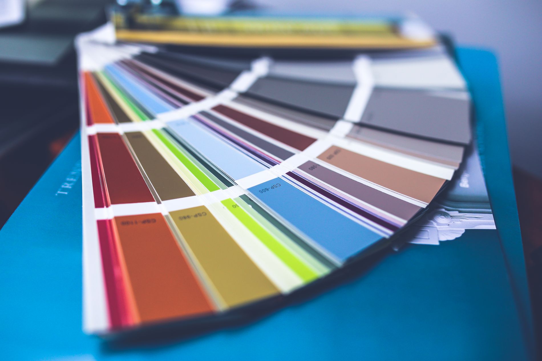
Making use of colours
Let’s take a look at some of the colours often used within website design and how what they represent.
1. Red Websites
The colour Red is a colour that represents power and energy. It is often used in environments to show passion and strength. The colour is so intense that it increases a person’s respiration rate, and it is often used combined with orange in restaurants to make customers feel more hungry. The colour red is useful for websites that offer a food related service, and when combined with black, is used to show success and dominance
2. Black Websites
Black is a colour that can be used to represent dominance or elegance. It is often said that it is not a colour because it appears on surfaces that don’t reflect light, so in essence black is the absence of colour. Although it is often referred to as a negative colour, black is useful for web designers who are looking to create a classy or urban website. Black has the advantage of making images more dominant, and so it is a useful colour to have on a photography website.
3. Yellow Websites
Yellow, like the colour Red, is a colour of energy. It appears whenever happiness is shown, but it is most useful when a warning is given. You can find the use of yellow combined with black text and images in street and hazard signs. Even in nature these colours appear on toxic and poisonous animals such as; bees, wasps, frogs, and snakes. Construction websites often use the colour yellow in their brand as a way to compliment their services. When used correctly it makes a children’s website very cheerful and fresh, and can also be effective on call to action buttons.
4. Blue Websites
The colour Blue represents trust and is reminiscent of the sky and sea. In contrast to the colour red, it is a calming colour that helps people relax by slowing the human metabolism. Because it is a cold colour, you will rarely find it used in environments where food is served. You are more likely to find it used at informal environments where trust is important, such as; pharmacies. Blue is effective for E-commerce websites that sell health related products, and when combined with the colour White it makes a brand appear trust worthy.
5. White Websites
White is a colour that is associated with purity and light. It is the polar opposite of Black because it is the presence of all colours combined. White is used as the ideal surface for writing and planning, and can be found in environments and instances that communicate cleanliness and freshness. In web design white is used to give a page more breathing space, this reduces the strain on a visitor when reading or concentrating on content. When a light shadow is used on objects, the website contains a subtle sense of depth.
6. Green Websites
Green is the colour of nature because it resembles plants and trees. It is a colour that can be used to associate with natural health, growth, safety, and even money. It can be found in high street brands that offer natural alternatives to products, and is often used on the packaging of medicines and vitamins. Humanitarian and charity websites use green in their design to give a sense of hope and stability, and has been used by those in the medical practice to gain trust.
