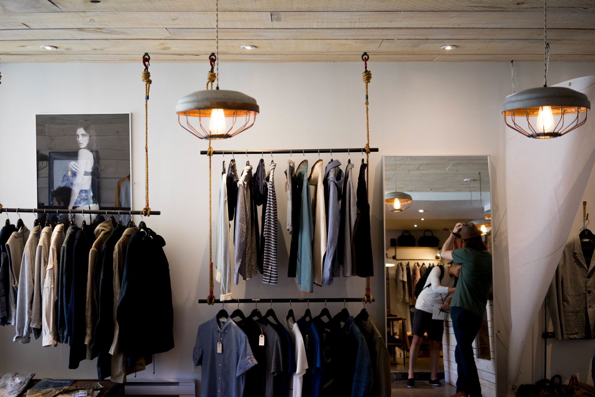
50 best fashion ecommerce web designs
So if it takes a user only 50 milliseconds to form an opinion about a website and that 94% of a first impression is design related, we think you’d agree that the best and most well-known of the fashion industry would naturally be on top of their game when it comes to their site’s web design. After all, let’s face it; creating a great impression is really and truly the driver of the fashion industry. But, what if I told you that even some of the very best of fashion ecommerce suffer from really really bad web design, you’d be intrigued right? But woah hold your horses now, I’m not going to tell you who just yet.
So how did I find out who’s hot and who’s not?
Well, with input from our SEO gurus, digital designers and generally anyone in the team who loves a spot of window-shopping, I was put to the ultimate test to get my fashion critique out and rank a random yet well-known list of 50 fashion sites based on their web design and whether they hit the requirements of a good fashion ecommerce site. This included judging each brand on:
- Performance and display on a mobile platform. Come on 74% of us browse the internet on our phones, so this was important
- User experience. Does it do a good job of engaging us and what about that navigation? Are we led to a place where we may be tempted to buy?
- Va va voom! Now this is the X factor of each site, the question is, did the site’s overall web design deliver?
After this analysis, I was able to draw up a list of the best, the mediocre and the downright bad in fashion ecommerce web design. It’s fair to say some are truly shocking, cough, Zara. While others, though unassuming, are pretty good for providing us with great web design inspiration.
Now in no particular order, I’ve grouped the 50 in categories from the best of the best in fashion web design, the mediocre so-so’s, to the downright bad. Remember each site has been judged on overall web design, functionality and performance on a mobile platform to justify the list.
The best of the best of fashion web design
The neither here nor there group of fashionistas
The downright bad in fashion web design
The best of best in fashion web design
Starting the ball rolling with the very best in fashion web design we have…
Tom Ford
Tom Ford is a fashion website to be reckoned with, the word that comes to mind is power. Bold content and even bolder images. What’s interesting is that whilst our designers advocate white space, Tom Ford’s website is a clear exception to the rule. Apart from the header, the entire landing page is divided into equal sized images with not even a smidgen of white space to fill. Tom Ford you beaut you.
What we love:
- The simple hover over each section gives the user a strong call to action to explore further with it’s darkened background
- The typography adds to the power of Tom Ford as a brand, it’s bold yes, but thankfully it’s not loud, it adds to the overall feel the user gets once landing on the site
- The beautiful high quality and close up imagery gives the site that an altogether established feel
What needs a helping hand:
- The site doesn’t look as half as good on a mobile screen than it does on a desktop, and what’s more we have to scroll horizontally – I really wasn’t expecting that of the fabulous brand
- There a few issues with the site’s speed on both desktop and mobile platforms which could do with some TLC
- I really think moving those social media icons above the fold would help push the brand further into the social sphere
Karl Lagerfeld
There’s an endless scroll and for once I’m not complaining. Karl Lagerfeld’s portfolio style website is both visually inviting for the user and fun to explore. Come on, we all love a bit of Karlism and why wouldn’t we with a web design like this, it’s downright fabulous.
What we love:
- The endless scroll gives the user the opportunity to explore different sections of the website when something interesting catches their eye. This way there are endless opportunities for calls to action, and from what I can see, exploring ‘Karlism’ is the main one
- The content titles – I love how the titles rapidly appear when I go to hover over an image box. This adds to the overall bold impression when visiting the website
- The fixed navigation top and bottom bar again is designed purely with the user in mind, it’s great for navigating around the site and in case any visitor were to forget, Karl Lagerfeld’s logo is right up there with the bold and the beautiful
- Works pretty darn well on a mobile platform from good speed and fabulous user experience, Karl’s impressed me for sure
What needs a helping hand:
- Although the site performs well on both mobile and desktop platforms, look into the resources that are blocking the site from loading even faster, that really is my only criticism
NET-A-PORTER
I see heavenly web design balance with NET-A-PORTER’s website, it’s clean and bold with high quality images and more importantly consistent with it’s choice of content and font size. I immediately feel like I’ve accessed an up-market fashion website. Maybe it’s just me but I want to be a part of this exclusive fashion community, so don’t mind my expression of web design love for NET-A-PORTER’s website.
What we love:
- I love the rotating live feed of the most popular items being sold – a virtual shop window if ever there was one
- The magazine style layout of the landing page gives the user a visual feast of what the brand offers, the distinct and separate sections add logic for great user navigation and overall user experience
- With no problems with how the site displays on a mobile screen I know I can take NET-A-PORTER everywhere I go pretty easily
What needs a helping hand:
- With a site as beautiful as this, I’d look to incorporate a fixed navigation bar to allow the user to simply point and click for a better and altogether easier navigation
- Is that content legible on a mobile site? I don’t think so, time to pay a little attention to how those images and content appear on all platforms
- Clean out any files that could be hindering the site to load quickly, the brand’s speed score isn’t great and I can tell you now, it’s not what I was expecting
Ralph Lauren
Now I’m sold within seconds of landing on Ralph Lauren’s web design. It’s sleek, sophisticated and all about the images. As a user I can’t help but want to delve in, even if it’s just to look at the pretty pictures.
What we love:
- The all you need in a one page scroll, this feature gives the user an inviting snapshot of what to expect when exploring the website, it’s no wonder it’s becoming a web design fashion favourite of mine
- The manual rotating banner isn’t usually the most exciting feature, but here, every click automatically changes the bottom banner, which in effect changes the entire display of the landing page to promote each individual campaign. It’s chic and something I know I won’t forget in a hurry
- The site fits perfectly within the screen of a mobile site’s making for an excellent user experience
What needs a helping hand:
- Right so we’ve had a look at how quickly that site loads on a mobile and desktop platform and it’s not that great. Test and monitor ASAP
- Do you really need those page re-directs? No, thought so; maybe it’s time to get rid of them so to speed up the site’s loading time. What’s more, studies have shown that users are not likely to wait that takes ages to load and altogether brand them as distrustful
- Where are the brand’s social media icons? The importance of social media shouldn’t be underrated. Make them bold for the user to tweet and share your products, you know social commerce is in other words social Currency with a capital C
ASOS
There’s no denying that all of us love love LOVE ASOS and from a web design point of view, ASOS is a great example of a brand that really knows their user and more importantly cares about them. With a great magazine layout and clearly defined areas, ASOS’ web design literally holds the user’s hand through the site, enticing them with special offers as well as offering them the opportunity to become part of the brand’s social community. Great typography, fabulous images and consistent structure is what makes ASOS’s site a fashion ecommerce beauty.
What we love:
- I love how the web design clearly splits the men’s and women’s collections distinctly without looking chaotic
- I’m told immediately that there’s free shipping to 190 countries and this piece of content is above the fold, so it’s guaranteed to engage the user immediately, clever, very clever ASOS
- The site looks great on a mobile site and with no user experience issues I know I’m happy to buy on the go
What needs a helping hand:
- Avoid those page redirects and look to reduce that server response time, with a less than average loading time score, the site would benefit from a little speed TLC
Dolce & Gabbana
Dolce & Gabbana’s website is simply a piece of art, something we can all agree on here at JBi. It’s clear that Dolce & Gabbana is more than just a fashion brand but rather a lifestyle the user can aspire to be a part of. My kind of site for sure.
What we love:
- The background colour – as much as the designers here are not fans of dark backgrounds we all agree that Dolce & Gabbana are a clear exception since the background adds that mystique and exclusivity to the overall web design
- Large imagery and hover over – this feature adds to the allure of the website and gives the user an experience rather than a simple visit to another fashion site
- Excellent user experience on a mobile site – no issues with legible fonts or how the site appears on the screen, the user is also offered a rotating newsreel about the brand’s news. Now that’s fancy, I like
What needs a helping hand:
- Optimise those social media icons – the brand is active on a number of platforms yet the user has to search for the icons because they aren’t very clear. Why not adjust the colour of the tab so that they are visible and easy for the user to navigate to
- I’m actually a little surprised why a large exclusive brand like Dolce & Gabbana haven’t paid greater attention to the site’s speed on both the desktop and mobile sites, you do know that it’s proven users don’t stay on a site longer than 50 milliseconds if it doesn’t deliver
Urban Outfitters
There’s definitely a theme here with the style and layout of this brand’s web design, starting with a full-width image followed by a smaller image and then another full-width image and so on. Whilst I think this layout is effective, it’s clear the brand has prioritised the most important campaigns to feature in the larger spaces. All in all, I like the brand’s web design, not only because it’s fabulous, but because it also looks great on a mobile, proof enough that this brand knows it’s target audience.
What we love:
- High quality imagery goes a long way and here Urban Outfitters have ensured no lacking on this front, it’s inviting and altogether has the user’s attention
- The mobile site features the landing page in all it’s glory. There are no issues regarding the site’s font, how it looks on a mobile or if the tabs are tappable, always a good thing
- The consistency of the site and bold typography of the landing page is altogether great for a fun user experience
- Social media integration – the dedication of a content box inviting the user to interact showcases the brand as one that understands its user and target audience
What needs a helping hand:
- Bring that site speed up to scratch by optimising images and generally cleaning out anything that slows the site down without me being too technical
- Consider integrating a mix of content, why not video or vines for a better user experience. Remember your audience. Young, fun and technologically savvy, I know I’d like some bit of oomph
Nasty Gal
So I land on Nasty Gal and I can’t say I find it anywhere close to nasty! Okay jokes aside, I think Nasty Gal have got a unique design that we all agree is pretty cool. The frame-like display of the website gives off the impression that this is a website that’s contained; it’s neat and no fuss.
What we love:
- The live chat function – this is a function that ecommerce sites generally take for granted, for me, it adds credibility to a site and gains that loyalty from the user. And from all the ones I’ve seen, Nasty Gal are the only ones that have this feature checked
- Clearly defined sections – the landing page may be short with only 4 distinct sections, but that’s the point, here less is more. The user isn’t left in a flurry of where to go next. Logical web design really does go a long way
- Fixed navigation bar – it may be a small web design feature but it’s underrated when it comes to ensuring great user experience
- Strong typography – adds to the bold edgy web design and act as effective calls to action
What needs a helping hand:
- Make that logo loud and proud! It could be down to taste but I think that the logo needs to more commanding, you don’t want the user forgetting where they are do you?
- Your mobile site speed could be much better, but no need to fear, look to clear out any blocking resources that effect your page from loading quickly
- Consider boosting those social media icons to above the fold for better interaction with your user
H&M
Okay, so I love H&M, their site is unassuming and tells the story as it is. The layout is inviting not only because of the great imagery but also because of the strategic calls to action above the fold. The only thing I would say is…go wild! Show off a little, H&M, you’ve know you’ve got it why not flaunt it.
What we love:
- The landing page is a mix of large imagery, video and typography we’re guaranteed to stay for sure
- Subtle calls to action on the images telling the user how much that top costs or when the next sale is
- Card tile display helps to organise a large site without compromising on aesthetic appeal
- Excellent user experience on a mobile platform, no problems with font sizes, screen sizes or tab taps, I’m happy
What needs a helping hand:
- Fixed navigation bar – there’s loads of great info on the full bar so keep the user informed whenever they scroll
- Make that main image as part of an automatic image slider, it’ll add to a much better user experience in giving the user the opportunity to view more of the brand’s collections, also I know that it’s a feature that would guarantee users like me to stay that bit longer
- Consider optimising your brand’s mobile site speed. You know the drill, optimise those images and operate a clean out of any blocking resources slowing down your site
Paco Rabanne
Paco Rabanne’s web design oozes high quality imagery and sophistication. On landing, I’m taken straight to the catwalk (on the big screen) and once that’s over, the images rotate to give the user a sneak peek of what’s new with the brand. I have to say that Paco Rabanne’s web design is minimal but by golly it’s powerful.
What we love:
- I love how the side navigation bar is both commanding and adds to the overall web design of the site – this is something that I’ve found is pretty rare
- The full background video. Now, I can imagine it’s not everyone’s cup of tea, but it’s proven that users stay longer to watch a video than any other type of content. I think for Paco, it seems to work pretty well in making that exclusive impression
- High quality imagery is always a great shout, and here it adds value to the brand’s own image
- I love that automatic vertical scroll of all the large imagery, it’s as if there are three very different landing pages all in one!
What needs a helping hand:
- Look into how well the speed of the site performs on all platforms, consider a monitor and measure for a better user experience
- Darken that font for better readability, the little things matter
- Ensure that the music from the catwalk video is an optional addition, discretion is key when it comes to blaring music as part of your web design
Reserved
Reminiscent of Pinterest, Reserved’s web design is heavily image focused and cleverly defined. I love how I’m told immediately the news of a mid-season sale and that too in a bold red, a fashion emergency if ever there was one to shop.
What we love:
- The card tile effect layout gives the user a clear idea of where to go next and more than anything adds to the overall visual impact of the web design
- Web design symmetry – Reserved have nailed the symmetry of their site so that it is aesthetically pleasing to the eye
What needs a helping hand:
- Make that social media tab an icon, it adds to the user experience and the overall visual appearance the brand is clearly going for
- I’m impressed that the site loads well on a mobile site but why oh why doesn’t the mobile site look the way it does on a desktop? Fix this as soon as for a better user experience, again no one likes having to scroll horizontally, it’s a web design faux pas
Burberry
With an almost edge-to-edge main image, the user is led to a scene when landing on Burberry’s website. It’s both exclusive and very high end. On scrolling Burberry have given the user the opportunity to really view each product display which adds to the exclusivity of the brand.
What we love:
- Great mobile user experience, easy to navigate and excellent readability makes navigating the brand’s mobile site simply fabulous
- Love the content box details that come up as the user hovers over each image. It’s inventive, as it doesn’t take away from the beauty of each image
What needs a helping hand
- Fix the side navigation bar better user experience and easier navigation
- Why not consider a larger or lighter font size or colour as the content seems to be overpowered by the dark background and this takes away from what is otherwise a great user experience
- Look into the speed of the mobile site, poor loading costs users, it’s as simple as that
Armani
With it’s strong and high quality images, it’s no wonder why each and every space on Armani’s landing page is taken up with these image beauties. I certainly feel special as a user and really and truly isn’t this what every fashion ecommerce site should aim to achieve? Let me put it this way, I’ve stayed way past the 50 milliseconds on Armani’s website and know what I want for my birthday.
What we love:
- Close up large imagery – each image is beautiful and reflects the brand’s high-end appeal
- The hover over feature – each image highlights with content on hover, not just a piece of fashion art then
- Displays beautifully on a mobile platform – now it is often taken for granted with fashion site’s but I love that Armani configures perfectly on every mobile device
What needs a helping hand:
- Have a look into optimising those images on the mobile site, they are stunning, so why not show them off?
- Consider optimising that font size so users can enjoy a better user experience
- Have a look into that server response time, monitor and measure where your server is spending the most time
M&S
Whoever designed the M&S website has done a pretty fine job, from frumpy to distinguished, the website gives off an air of an established up-market brand. All of us are suckers for big clear fonts and clean images, and this is a feature that runs throughout the site, so yes we’re all happy when it comes to the consistency of the site. From a user’s point of view, I think M&S have done a fabulous job to give a heavy website solid logic through a clearly defined navigation top bar as well as clear sections on the website. M&S have succeeded in designing a website that altogether appeals to all age groups with it’s easy navigation and sophisticated feel.
What we love:
- Consistent bold typography adds to the overall aesthetic appeal of the site and calls for a better user experience
- Understanding the user’s journey –M&S have nailed this because despite being a large and potentially busy site, the brand have defined solid logic with a clear navigation top bar and clear sections on the website
- Enough white space adds balance to overall bold design giving the site a more distinguished feel when the user first lands on it
What needs a helping hand:
- Incorporate a fixed navigation bar, it’s an underrated feature that can do wonders for a greater user experience
- With a less than optimal mobile site speed, clean out those blocking resources, optimise those images and reduce that response time
- On viewing the site on a mobile platform I’m impressed but I think a tiny tweak to those tap targets would take the mobile site’s user experience to the next level of fabulous
Fat Face
Now Fat Face is different, there’s no pretty introduction or sneak peek into what goodies the website holds past the landing page, instead Fat Face gets straight into showing off it’s products. I like that Fat Face is no fuss and quite simply gets on with it.
What we love:
- The Pinterest inspired layout of the landing page is particularly fun because once you click on a box it expands and the page completely rearranges itself. What’s more you have the option to view the product as a web exclusive or as an expansion of the page. We all L-O-V-E it
- The hover over each image shows different colours of each product item giving the user an even more interactive experience
- Change of layout option on the top left corner of the page– the user has the added option to change the layout of the landing page to their preference, so if you fancy a list, or a grid or more of the Pinterest style, you can with Fat Face
- I love the fully functional navigation tool bar, it’s easy to use and with the clear defined search filters, the user can navigate straight to their chosen area
What needs a helping hand:
- Our designers have had a look too and think that fixing that side navigation bar would give the user a more easier experience
- Get interacting with your users! Optimise those social media icons and make a stronger call to action to sign up to the brand’s newsletter
- Pay particular attention to how the brand can speed up loading time on their mobile site
Shopghost
Shop-ghost is quite simply a feast for the eyes! It’s clear with the site’s web design that bold images are the main focus but what’s really interesting is the way the images are displayed. The long scroll of the site allows for the prominent images of each campaign to act as a top screen introducing a collection so that when you scroll the prominent image shrinks, the beauty of parallex. What’s more, this is a site where busy is actually a good thing. So let’s get stuck in.
What we love:
- Though the font size is inconsistent and in bold capitals for some reason it works in tying Shop-Ghost’s quirky design together
- Parallex scrolling and strong imagery gives Shop-Ghost’s web design an edge and makes for a fun user experience
- I love the scrolling tab feature scroll through the site; again the little things with the web design keep the user engaged and curious to see what other treats the brand offer
- The highlighted calls to action with colour hover overs on the images and titles
What needs a helping hand:
- Yikes! So the mobile site suffers from illegible font sizes. And yet this is one of the features we love on the desktop site. I’m not all that impressed especially if I can’t see them all that clearly on my portable hand device
- Ensure that the mobile site is well optimised and fits the screen so the user can view and browse the site in all it’s glory
Airwalk
Airwalk is definitely high up on my list of favourites. With so much to see and interact with, it’s just fun to have a little play. It’s one of those web designs that seem to have everything covered, from the quirk, strong calls to actions and a bucket load of va va voom. It’s clever and different so why wouldn’t anyone like it.
What we love:
- The rotating bold full screen background images and the automatic scroll is simply a treat. I love how the background images change on scrolling. What’s more interesting is the vertical split of the landing page where the images travel in the opposite directions
- The number of different types of content featured on the landing page, from videos, large logos and written content, the user is thoroughly engaged
- The top bar and the left hand side bar are fixed and this is particular useful for users to easily navigate to What’s more, I absolutely love that the two bars are distinct, one purely for interaction e.g.: social media calls to action whilst the other features tabs to explore the inner pages of the site
- With no issues concerning readability, optimised images or how the page fits a mobile screen, Airwalk offers the user an excellent experience on a mobile device
What needs a helping hand:
- A simple tweak on speed issues to help render the site quicker would be worth looking into – so consider compression and optimised images and Airwalk will be well on it’s way to one of the best fashion web design site’s out there. I’m a fan as you can probably tell.
Missguided
Missguided is a site that fits the profile of the young and fashionable. Yes the site is simple and hits all the top requirements for a good ecommerce site, but I think, Missguided has the potential to be absolutely shamazing. You can tell I’ve been keeping up with the brand’s news.
What we love:
- The dark hover over feature on each section gives the user a good old nudge to visit each section in depth
- The fade in and out slider gives the site better flow and the user a visual treat reflecting the brand’s personality
- The fixed navigation bar makes it easier for the user to navigate to each section with ease
- The site appears fabulously on a mobile device. Amen to that!
What needs a helping hand:
- The bottom slider could do with a boost, so why not consider an automatic slider to give the user a better experience, make it a perfect moving clothes rail, I know I could do with one
- As much as I love the hover over feature, I think incorporating a different colour or zoom in function would give the highlighted sections better impact
All Saints
There are no frills with All Saints, I’m told straight away that there’s free delivery on order over a certain amount as well as free UK returns, it’s no wonder why the cards are out. My first impressions are, ‘here is a brand that have their target audience firmly in mind’; young, fashion forward and edgy, and this is exactly what I’d say about the website too.
What we love:
- We all love the card tile display of the images and separate clickable content boxes on the landing page
- The strategic placement of content and calls to action to ‘Shop Now’, as if that’s not a hint and a half
- The dedication to social media! Scrolling to the bottom of the page invites the user to interact with the brand whether it’s on Twitter, Facebook, Instagram or even just to learn a bit more about the brand itself
- The colour palette and strong imagery reflects the personality of the brand. Ooh edgy
What needs a helping hand:
- Incorporate a fixed navigation scroll – while the page isn’t particularly long, the user needs to scroll back to the top to view the sitemap. It would be worth fixing the side navigation bar for an easier user experience
- Look to optimise those images on the mobile site, not only will it save a good few bytes of data but also speed the site’s loading time up which isn’t all that great
- Ensure consistency with your typography for better aesthetic appeal, it’s only a little issue but I’m being particularly fussy
The Dressing Room
As simple as the site’s website appears, I think that there are a few web design gems in it that I can’t help but love. From a blank canvas background and great typography to a rotating awards reel, we like this dressing room because it makes everything look good!
What we love:
- Ticks all the boxes of a good fashion ecommerce site, including bold calls to action to explore sales and a large search bar for logical navigation
- I love the friendliness of the site, I’m given contact details immediately as well as useful information of what the site offers
What needs helping hand:
- Bring the site above the fold – our designers say this because The Dressing Room is not a particularly large site and would benefit from compressing and optimising it’s images to ensure greater speed and better user experience
- Oh how things fall, unfortunately both the desktop and mobile site’s suffer from pretty dismal loading times, now this needs to be addressed as soon as because it will turn your users off and take away from a good user experience
Pixie Market
So it’s short and sweet, not fussy and really, just does the job. I can’t fault Pixie Market that much, but I think little things like incorporating a zoom in function would give the web design a boost, just that little something something if you know what I mean.
What we love:
- The one page scroll keeps everything above the fold and easy for the user to gather all the information they need quickly
- Love the fading rotating banner of images which act as the main focus for the user, it’s engaging and acts as a strong call for action to explore the site further
- Excellent mobile site user experience – this is a brand that knows it’s users well
What needs a helping hand:
- Opt to make speed a priority to sort out, with just an above average score, ensuring that those images are optimised and server time reduced, we can ensure that Pixie Market performs better on both platforms
London Boutiques
London Boutiques features a web design that’s made for the young, modern and fashionable woman of today. It features everything from strong calls to action to get involved with an incentive driven competition, to read the latest recommendation of the brand as well as to find out what’s going on in stylish London town. London Boutiques is the perfect one stop shop for all the young fashionistas out there. Organised chaos is what I’d say about the web design and that really isn’t a bad thing.
What we love:
- The live feed rotating feed of the boutique’s favourite picks and the strong calls to action to shop now is something that I always appreciate so I don’t mind if I do
- The jam packed layout of everything a girl needs on a landing page – although there is a good deal of white space, I think London Boutiques have done well to organise an otherwise chaotic site, with strategic content placement, the lighter focused images above the fold and consistent content boxes, I think London Boutiques have got it right
- The strong calls to action – from competition and prizes to the next best place to go in London, I know the user will happily get lost on this site
What needs a helping hand:
- Consistency with the choice of content throughout the landing page – this could also be a subjective issue, but for better readability, I’d consider choosing consistency over quirkiness especially if it isn’t a feature that is concrete throughout the landing page
- Consider making the top and bottom bar equal size for a better balance of the landing page, and remember to include the most important content at the top and above the fold. So if you want your user to follow you on Facebook, make sure your icons are at the top, the same goes if you want them to sign up to your newsletter
Mr Porter
I say Mr Porter, you are sleek sophisticated and straight forward aren’t you. I think this design is really well crafted, not just because it’s an addition to NET-A-PORTER (so it’s bound to be good), but because it’s defined itself as a brand exclusive to men.
What we love:
- The mix of content – I think the integration of video clips on the landing page gives Mr Porter a boost and that bit of excitement, and who wouldn’t want that from Mr Porter
- The consistency of font –Mr Porter’s logo and changeable content adds to great readability and organised web design, something I know we don’t take for granted here at JBi
- The site displays effectively on a mobile platform, we found no issues with readability or how the site looks on a mobile
What needs a helping hand:
- There’s not much wrong with Mr Porter but I think a fixed navigation bar would offer a more optimal user experience
Avenue 32
Like a perfectly packaged gift, Avenue 32’s web design is simple yet effective. The positioning of the brand’s logo and the ‘designer’ tab on the side of the web page further emphasises this concept; it’s no wonder I’m eager to find out more.
What we love:
- I love the layered approach of this particular web design, the horizontal lines for each distinct section perfectly organises a busy site without being chaotic
- Thank god that the site displays well on a mobile device and more importantly fits the screen, whilst I’m not too worried about the font size, I would think a little increase would allow for better readability
- Excellent user experience on a mobile platform
- I love the rotating scroll of ‘what’s new’ at Avenue 32 – the perfect virtual shopping window if ever there was one
What needs a helping hand:
- With such an informative navigation top bar including specific tabs, a help tab, member login and a shopping cart, look into incorporating it as fixed navigation bar for better user experience and easier navigation
- Consider to repeat the social media calls to actions at the top of the landing page as it provides the user with a strong call to action, remember always prioritise all your best content for above the fold
- Look into cleaning out anything that blocks the site from loading quick time
Vestiaire Collective
So if there’s a web design that’s more interactive than Vestiaire Collective let me know because nothing has topped Vestiaire Collective so far. With a tab dedicated purely for the profiles of new members, Vestiaire Collective knows how to make their users special.
What we love:
- The virtual window shop – Vestiaire Collective gets stuck in by giving the user a literal news reel of what’s ‘Just in’
- The magazine feel of the web design directs the user to explore different areas of the website with easy navigation
- I love the strong calls to action at the bottom of the page directing users to subscribe, buy or start selling. I can tell you that I’m sold for sure!
- Excellent user experience on a mobile platform – I’m not complaining for once
What needs a helping hand:
- Pop out features for each item – if you’re going to promote each item on the landing page, why not show them off! Give the user the option to zoom in or a hover over angle display. Product display my friends
- Why not think about speed, no one likes to wait, so consider clearing out those blocking resources
7 Diamonds
It’s true that great images and placement make a site more appealing and here 7 Diamonds is a perfect example of how to showcase your site’s best bits. My favourite feature has to be the hover over motion video on the main image, if that doesn’t float your boat I don’t know what will.
What we love:
- The sporadic placement of images – as much as the web design includes both landscape and portrait images, it works since the images are both a mixture of motion video and high quality visuals
- Fast speed on a mobile platform – I’m impressed to see that there are no page redirects or blocking script or CSS resources in the above the fold content
What needs a helping hand:
- The site looks unfinished with a patch of empty white space, I would think reshuffling or adding more images would add better value to the site’s web design
- Ensure the site is responsive and fits the screens of all mobile devices because all I see is nothing but cut off typography and blank space. Not the best look my boat friends
- Make that font bigger – I think that the site could do with a little attention on the font size and bringing those social media icons to the top for a better user experience
Abercrombie & Fitch
It’s simple and to the point. But it seems as though Abercrombie & Fitch are not too keen in displaying their collection as beautifully as other fashion site’s however, this is not a problem because Abercrombie & Fitch compensates with strong calls to actions. I think Abercrombie gets the job done with their simple but effective web design without being boring, something I think is pretty clever especially if they’ve got my attention.
What we love:
- Strong calls to actions – the red bar telling us that there is ‘Free Shipping on all orders’ above the fold not only breaks up the grey background of the site but also gives the user important information about what the brand offers you for FREE! Free clothes, don’t play with me bro
- The distinct sections of the website make it easier for you to navigate through to the different pages of the site
- Looks great on a mobile platform, so if I want to take advantage of those freebies on the go I can easily
What needs a helping hand:
- With 3 blocking resources, clean these out for a faster user experience
- Brighten up that top bar so the fonts are clearer for better readability
Timberland
Timberland’s web design is in ‘the one page says it all’ style. It’s classic colour and minimal appearance is what any user is drawn to immediately. While it is much simpler to the other fashion site’s reviewed, I think it’s fair to say that the web design is so consistent with it’s offline branding that you know you’re on Timberland’s website.
What we love:
- Well of course that one page feature, it’s simple and altogether effective, the user doesn’t have to worry about scrolling – always a good thing in my book
- The zoom in and out feature for each content box adds to the overall dimension of the web design, I think it takes a flat design and gives it a little somethin’ somethin’
- Bold typography and calls to action, now for me, this matters because it reflects a strong and altogether established brand so of course I’m going to listen
What needs a helping hand:
- Woah with a number of blocks on the site stopping it from loading quick enough, Timberland could do with a kick up the booty to sort it out, after all, a poor site speed never gets a great site anywhere
Me & Oli
Fun is the word I’d use to describe Me & Oli’s web design. It’s interactive and very different, not your usual fashion ecommerce site for sure! Go on, go and see what I mean.
What we love:
- I’ve said it already but I love the interaction aspect of the landing page, it adds to the quirk and overall impression of the website, I know I won’t forget Me & Oli in a hurry
- The one block colour background throughout the site adds to the minimal no fuss web design
- I love how quickly the site loads on a mobile device; I’ll admit that this is something I was worried about
- I love the type writer font of the brand’s web design, it’s fun and totally different to what I’ve seen so far
What needs a helping hand:
- Legible font- as much as I love the concept of the brand, the font size could be better optimised for a better user experience, sometimes aesthetics should come second to practicality
- Oh yes let’s not forget, fix how your site appears on a mobile screen, it’s the difference between a great user experience and a downright bad user experience
The neither here nor there group of fashionistas
Moving swiftly up a notch and presenting the more mediocre bunch of the 50…
Farfetch
The landing page is split horizontally with three different sections promoting three different campaigns. Each section is heavily image focused with minimal content and lots of white space. Now some may think that white space is a bad thing but I beg to differ, I think it adds to that bit of va va voom and altogether makes Farfetch’s unique images stand out even more. Hey and let’s not forget the layer upon layer of parallex beauty that Farfetch have integrated. It was all looking great but then I turned my critique to a mobile platform and things fell apart a bit.
What we love:
- The parallex scrolling feature, now this doesn’t only add a beautiful dimension to the landing page but it also showcases the brand’s high quality images in a more creative and visually appealing way
- The simple yet bold typography is commanding and draws the user to explore each particular section
- The GIF boxes, now that’s how you do GIF’s without it looking tacky!
What needs a helping hand:
- How the site appears on a mobile screen – with a beautiful web design it’s a shame that the site doesn’t appear as well on a mobile platform. Consider those font sizes and tap targets, remember every little helps
- Clean out those blocking resources for your site to load fast and more effectively on all devices. Now, I’m just taking a guess here but let’s say that a majority of the brand’s target audience view the site on their smartphone, it’s then important that the mobile site is perfectly optimised
Watch that label
With only four sections on the landing page, Watch that Label is minimal web design at its finest. The one thing I’d say is, as a user, I’m kept wanting more. Clever or too minimal really is the question. You’re going to have to help me out now.
What we love:
- I love the projected zoom in and out feature for each content section on the landing page as it adds to a more interesting web design
- The short scroll, minimal content and images allow for easy navigation and optimal user experience
- The webpage looks good when loaded on a mobile device and thank god for that
What needs a helping hand:
- Things have really fallen apart given that the site performs extremely slowly on a mobile and desktop platform; now this impacts the overall user experience and takes away from the web design. Look to test and monitor this ASAP
Diesel
Diesel emanates cool web design with it’s unique display. The card tile effect of the landing page where the images meet content boxes is unconventional and reminds us of the likes of Esquire and Palace. It looks like a fun one, but it does fall apart when reviewing it on a mobile platform, so I’m not going to pretend that I’m not a little disappointed.
What we love:
- I absolutely love how the top bar changes colour depending on where the user scrolls on the landing page, it’s inventive and adds quirk to the overall design
- The card tile effect is in itself very fashionable and it works well in promoting Diesel’s many collections, it keeps an otherwise busy website, compact and easy to navigate
- The fixed navigation bar and what’s on it! We’re told of the main tabs and also given directs to the brand’s social media platforms, we can explore the brand that much better with this call to action
What needs a helping hand:
- Ouch the site does not appear to be fairing too well on the speed front and given the brand’s target audience I’d say it’s crucial this is attended to ASAP
- The mobile site’s font size is illegible and tap targets are not optimised, all in all this calls for a poor user experience
- The site appears to be unresponsive given that the site renders poorly on a mobile platforms. Time to get on it and start fixing up, don’t let that great web design down now
Aquascutum
With strong typography, centralised positioning and a subtle colour palette Aquascutum’s web design is incredibly British and luxurious. Also, if anyone knows how to make a flashing GIF classy it’s Aquascutum!
What we love:
- Simplicity – without any particularly bold images, the user enjoys a no fuss user journey
- Flashing GIFs done tastefully – I think that this small web design feature has a big impact in showcasing the brand’s collection
- The centralised positioning of the site – with a centralised header, the brand’s logo is commanding and reflects the brand’s established image.
What needs a helping hand:
- Fix that navigation bar – with a beautiful logo and typography I would want to show it off! Fixing that header would add value to an already great user experience
- Ensure that the site page fits the mobile screen so the user doesn’t have to scroll horizontally, it makes you look unresponsiveness, in other words fat. Catty i know, but it’s the truth
- Consider placing the brand’s social media icons at the top left of the landing page for better user experience
Crane brothers
Well it’s different for sure; one block colour background and a headless animated kneeling man, I don’t know what quite to make of it but I’ll say this much, I kind of like it.
What we love:
- The navigation bar collapses to show just the essentials when the user scrolls
- Simplicity and just the one animation attraction – I know the Crane brothers want the user to take a good look at that tweed jacket!
- The quirk and fun of the content. Just check out the Dispatch tab
- Absolutely no user experience issues on a mobile platform
- I love the quirky get in touch tab at the bottom of the page, it’s inventive and makes the experience all that more personal
What needs a helping hand:
- I’d bring the large heading ‘Contemporary Tailors’ right above the fold so the user knows exactly what the Crane brothers are about
Free People
I think there’s something very whimsical about Free People’s web design. From the images, the soft colour palette and the italicised font, I think Free People have cleverly created an experience for the user when landing on the site.
What we love:
- The unconventional and sporadic web design layout
- I love the strong calls to action below the navigation bar, if it means I win something I’m happy to interact
- The consistency with colour – all the images and the content boxes match the overall feel of the brand and this offers the user a strong experience when navigating the site
- I like the fixed top navigation bar as it makes for easier user navigation
- The site looks good on a mobile site making for a great user experience, tick tick tick!
What needs a helping hand:
- The top rotating slideshow could be centralised for better aesthetics and layout, it would also add to the symmetry of the landing page
- Consider fixing the full navigation tab bar for better user experience and navigation through the site
- I’d suggest optimising the images on mobile platforms and ensuring that the tabs are altogether tappable! I don’t really want to have to squint to read
Mango
My first impressions is that Mango is clean, no fuss and simple. I can see why the one page appeal for fashion websites does so well as it adds to that exclusivity and overall art of the website. With a simple top and bottom navigation bar, the user isn’t necessarily given an indication to visit any particular section of the website and for us that’s important. The question is, does Mango do enough on web design.
What we love:
- Mango have got it on the money with beautiful imagery that spans the background of the webpage, it draws the user in and reflects a brand that is minimal and beautiful
- Mango goes for the less is more approach with it’s bold yet minimal content and one image
- I love that the site performs fantastically on the mobile site, the font is clear and it fits the viewport, something I know I never take for granted when browsing on my way to work
What needs a helping hand:
- Well I know I want to feel wanted, and as much as the beautiful imagery is concerned there’s nothing else that holds my attention, I think a zoom in feature on the image to view the collection would give the web design a more interactive feel than the flat feel it has at the moment
- Look into tidying those blocking resources up to boost your site’s speed
Shopbop
Shopbop is a really simple site with a short scroll. The site is divided well with the clearly defined navigation bar at the top. I have to say that the balance of the images, content and white space is great in maintaining that minimalistic feel. But does Shopbob have that oomph factor? Again, help a sister out.
What we love:
- With strategic placements of the search box, highlighted calls to action for ‘free express international delivery and easy returns’ an easy login and cart icon – it’s fair to say that Shopbob ticks all the boxes for the ideal ecommerce website
- The balance of white space and images adds to the simplicity of the site for a clear user journey
What needs a helping hand:
- The slider requires the user to click the tabs to move onto the next image, our designers have recommended an automatic function to reduce the number of clicks on the landing page
- Consider integrating a fixed navigation top bar as it would mean capitalising on what’s already a good user experience
- Optimise those font sizes on both the mobile and desktop sites
- A general web design push to make the site fabulous!
Les Nouvelles
Oh dear my eyes! What’s up with that faster than normal image slider? Now, I’ve asked the team and we all agree that the slider has left us a little websick, not the best look but I won’t write the site off just yet, so let’s see.
What we love:
- I love how the layout reflects the style of the fashion itself; it’s vintage inspired so that the image boxes look as though they are Polaroid cut outs
- The one page appeal means that the user doesn’t have to scroll anywhere to get to exactly where they need to be
- The symmetry, typography and white space of the site adds to the overall experience when landing on Les Nouvelles
- The mobile site loads pretty well, of course there are a few things to tidy up but otherwise not bad
What needs a helping hand:
- The mobile site is not quite right given the site doesn’t fit the screen!
- Fix those font sizes – I love the font style already, so don’t let the user down by not ensuring that they are legible on a mobile site
- Oh that slider! Look to slow down the speed of those slide changes as soon as possible as it takes away from an altogether good user experience
Not just a label
Okay so it’s not necessarily a fashion site but it promotes the works of contemporary fashion designers, think a fabulous fashion hub and you’re pretty much there. Set on a plain background, the site’s main focus is the beautiful mosaic design in the centre of the page.
What we love:
- The card tile effect of the web design –I like how each section is unique and introduced with accompanying content
- The strong typography linking the logo to the rest of the content maintains the consistency of the web design as well as the readability, which altogether helps to ensure excellent navigation
- I love the logic of the web design in featuring the best of each section as a piece of art itself
What needs a helping hand:
- With a beautiful mosaic displaying the site’s best bits, we think the site should display perfectly on a mobile platform, but it doesn’t so we’d suggest getting this sorted as soon as
- Make it easy for your user and ensure your site’s font is legible on a mobile platform
- The site’s social media tabs at the bottom of the page could be revamped into icons, saving space and altogether being more visual for a better user experience
Cropp
Now Cropp is definitely up there with the inventive sites, it‘s fun and heavily image focused with minimal content. The hover over each section makes the landing page that much more fun to navigate through with it’s Javascript animation feature. I think it’s fair to say the site is literally bursting with energy
What we love:
- I love the large image boxes that literally shake on hovering. It adds to the overall user experience and a special touch to the otherwise simple web design
- The strong black navigation tool bar is both commanding and easy for the user to navigate; what’s more I love the display of social media icons. It’s clear that Cropp love engaging with their user
What needs a helping hand:
- Cropp is a cool brand so make that logo loud and proud, the user should know where they are, and at the moment it’s shying away in the top left hand corner
- Let’s get that speed up to scratch on the mobile site, eliminate any blocking script and CSS resources and optimise those images
- Ensure the tabs on the mobile site are tappable, ensure a great user experience on all platforms and Cropp will be at the top of it’s game
Lola
Lola transports the user to the beach literally, with it’s simple full screen motion background of the beach accompanied with sound Lola is quite simply beautiful. My only qualm is, if I didn’t click on the logo, I wouldn’t have known if Lola was a fashion site.
What we love:
- The simple and beautiful motion video background, it doesn’t work for all site’s but I think it works like a dream for Lola especially in reflecting the brand in all its glory
- Strong typography – I love Lola’s bold logo, it’s established and reflects an up-market brand.
- It works pretty well on a mobile device too. That surprised us all!
What needs a helping hand:
- It’s fast become a pet hate of mine if the page doesn’t fit the screen size on a mobile platform. I know there’s not that much to see on the brand;s web design, but I would still say ensuring the page looks good on a mobile screen is essential in giving the user the best experience on a different platform
- I wouldn’t have known whether Lola was a fashion site so I would suggest adding a little more content e.g.: ‘Shop’ or ‘With love from NY’ – don’t leave me hanging completely
Emploi New york
It’s chic for sure, with its large imagery and minimal content, Emploi NY is a site for the young professional. I love the simplicity and effectiveness of the landing page and more excitingly the integration of the Vine videos as content boxes.
What we love:
- The Vine videos content boxes – now this is fun as when the user hovers over the boxes the Vine starts going, it adds to the overall web design and is generally quite fun to watch
- So I don’t know about you, but I’ve never seen a Contact Form quite like Emploi’s. The large image dedicated to represent the contact form gives off the impression that Emploi New York is a brand that wants the user to get in touch. Remember that good web design always considers human psychology
- The large bold content introducing each section draws the user in to explore and adds to the exclusivity of the brand’s image
What needs a helping hand:
- The automatic scroll –the web design requires the user to use their keyboard instead of their mouse for better and more accurate navigation, however, i think this hinders the effectiveness of the web design as the scroll doesn’t stop at the desired place when using the mouse. Not the best feature
- Yikes! Without displaying well on a mobile screen, the site looks as though it isn’t responsive and takes away from the overall web design
- Pay attention to your site’s speed, the little things really are the big things, consider eliminating those blocking resources and optimise those images
Topshop
I was pretty surprised with Topshop’s web design; for some reason I was expecting a loud and chaotic design (in a good way of course) but instead I’m presented with a neat and minimal webpage. It’s not bad at all, but I’ll be honest, my first impression was, ‘this is a bit plain’. I think given that Topshop is a global brand, their web design could be a lot hotter.
What we love:
- I love the centralised magazine layout of the site which makes for easy, logical navigation
- The balance of the bold images with the white space emphasises each section that bit better
- The display of the bottom bar which includes the brand’s social media icons and strong calls to action is fun and interactive for the user to continue exploring the rest of the site
- The font choice and size doesn’t only look good but is legible on a mobile site too – an altogether excellent user experience
What needs a helping hand:
- Speed is probably the biggest issue that the site suffers from on both the desktop and mobile platforms, e.g. the site has a number of re-directs that have to be loaded first before the actual site loads. No one like a delay
- Why not incorporate a zoom in function on the slider, just something to add a little excitement to the web design
House
Of all the web designs I’ve reviewed, House is an upside down site, which works. The navigation bar at the bottom of page fold cleverly splits the landing page into two sections that are completely distinct. The ‘first’ page is a high quality edge-to-edge image and the ‘second’ page is a Pinterest inspired page with blog posts.
What we love:
- The creativity of the landing page – House understands the importance of prioritising content above the fold so the site loads faster and altogether adds to a better user experience
- The sectioned off landing page –the fixed navigation bar is particularly important for keeping the two sections of the landing page distinct whilst giving the user the opportunity to navigate the site easily
What needs a helping hand:
- Now whilst the navigation bar is my favourite feature, the mobile site showcases none of it! In fact, when the user lands on the mobile site, I’m hit with an image and no call to action; this is not good web design guys
- Sort out that mobile screen, make that page fit the screen so the user can see that beautiful web design on a mobile screen
- The content that’s on the site isn’t all that readable on a mobile site, I would really consider getting those fonts sorted
The downright bad of fashion web design
And finally the downright bad in fashion web design, we have…
Rvlt Revolution
Wow, so we’re split, not everyone loves RVLT Revolution’s web design, but for me, it’s contemporary, cool and literally a piece of web design art, but are aesthetics the be all and end all of web design? I’ll leave it up to you to decide.
What we love:
- No scroll! It is the ultimate one-pager, all the user needs is perfectly boxed accompanied with strong calls to action
- Unique display of content and images – each section offers the user a literal sneak peek into each area of the website
What needs a helping hand:
- The site performs pretty poorly on both desktop and mobile platforms, so I’d look to encourage RVLT Revolution to look into this as a matter of urgency simply because their audience is likely to be young, modern and pretty technology savvy. Just sayin’
Totokaelo
Different is what I’d call Totokaelo’s website, with a video background, the brand has got my attention from the minute go. But once I’m done watching the moving background, however hypnotising, the content hasn’t had the same impact in keeping my attention.
What we love:
- The full screen repeat video background, it’s effective and adds to the minimalist look and feel of the website
- It’s a one pager and we all love those, again this adds to the minimal web design the brand clearly loves and calls for easy navigation
What needs a helping hand:
- A larger font size wouldn’t go a miss on both the mobile and desktop site if not for minimalism for readability
- The links and buttons on the mobile site are far too small for the user to tap, this requires attention pronto to ensure the user receives the best user experience
Closed
Okay, first impressions are good, with an automatic vertical scroll and fixed navigation bar with which I’m led to what seems like another landing page promoting the brand’s other collections every time the slider changes, is a feature I’m going to like. The web design is clever because of the four distinct landing pages essentially in one page, but on a closer look, I’m left squinting to read the content and hey i’m not all that impressed with how the site appears on a mobile device.
What we love:
- I love that fixed navigation top and bottom bar for easier navigation and greater visual appeal
- The consistency with the overall layout is of course the first thing I noticed, I love that with each scroll I see an edge-to-edge high quality image and the same content which adds to the minimal yet effective web design
What needs a helping hand:
- With poor compression results, blocking scripts, less than optimised images and a reduced server response time, the mobile site suffers from a dismal site speed
- The mobile site needs attention with how it appears on screen, make those fonts clear to read and those tap targets legible! I don’t want to have to zoom and scroll horizontally do we now
BokicaBo
Right, BokicaBo is a great site especially when you delve into it, but I’ll be honest the landing page didn’t grab my attention straight away which is a shame given that there are definitely some great features on the site itself. But as far as looks go on first impressions, I was pretty much ready to turn back and leave.
What we love:
- Those circular windows – the user is given an idea of what to expect if they explore further
- One block colour background adds to the simplicity of the site and keeps the user engaged on what the brand has to offer
- One page and no scroll is always a tick in my book, it keeps the user engaged and is perfect for easy navigation
What needs a helping hand:
- Ensure that viewport is configured on a mobile site so that the user doesn’t need to scroll horizontally to see your page
- Make the site more interactive; include social media icons and work on that typography. Be bold with BokicaBo’s logo
- Fill those circles with content or images to show the user what’s to come – bring the creativity of the inner pages to the landing page
- Those tweets don’t load! Now this is something that would naturally grate on me, it doesn’t reflect a brand that is altogether trustful or one that cares about it’s social presence. Apologies for the outburst
Zara
Zara is one of our favourite high street fashion brands (particularly for the ladies here at JBi) and while Zara’s web design is right up there with the leaders fashion web design with bold edge-to-edge imagery and minimal content, the question is how functional is Zara’s web design?
What we love:
- The edge-to-edge high quality imagery on the landing page showcases the very best of the brand’s collections
- The rotating scroll of images at the bottom of the page ensure the user has a novel user experience
- The white space consistency balances out the bold images adding to the overall aesthetics of the minimal web design the brand’s going for
- Interactive calls to action – ‘Follow us on Instagram’ encourages the user to explore the brand’s social platforms and interact directly with the brand
What needs a helping hand:
- Font sizes – I get it that Zara wants to maintain minimalism but it shouldn’t mean the user should squint to read the site’s content on both the desktop and mobile sites
- Slow down that slider speed, it doesn’t help with ensuring the user has a user experience
- Fix that side navigation bar as the content gets lost over the images, I’d look into minimising the images to ensure the content is readable
- Yikes, the mobile site’s speed could be much better for better user navigation especially when visiting a number of other pages. I’ve got to say this was one aspect that I wasn’t best pleased with, Zara is a brand for the young professional so it’s performance on a mobile was pretty surprising
Massimo Dutti
Oh no a pop-up, but I’ll give Massimo Dutti a break given that it wasn’t imposing and there was a clear cross button so I won’t be too harsh.
What we love:
- I like those bold background images particularly those that are close ups as it adds to the sophistication of the brand
- I’m impressed with the overall user experience on the mobile site as it fits the screen well and the content is legible.
What needs a helping hand:
- That side navigation bar is easily lost over the top of the large imagery – now I don’t think the brand needs to compromise on the background images, but for better user experience I’d consider a change of position maybe to the top of the page?
- The mobile site would benefit from considering the speed it takes to load the mobile site. With over 40 resources blocking the site to load quickly, I’m surprised the brand haven’t looked into this
- Social media is particularly important for an ecommerce site and the social media icons are extremely small on the desktop and mobile sites, give them a little boost in size and maybe bringing them above the fold
- For me the the web design suffers from balance, as a user, having to look for the navigation bar is not ideal
Quite THE EYEOPENER
Who knew M&S could be so design sassy or Massimo Dutti so design oblivious. Quite the eye opener for sure, and what’s more interesting the team were all pretty much on the same page with me when reviewing the 50 despite coming from different approaches. Of course there were some designs that just didn’t have the X factor, but there were also others that wowed, Karl Lagerfeld’s web design springs to mind. And though each brand is unique in their web design, it’s clear that there are some web design must haves a good fashion ecommerce site just has to have to differentiate themselves from the bad. Small but powerful features such as:
- a fixed navigation bar
- high quality close-up images
- automatic images slider
- a page that fits the screens of all devices
Now these are just a few design ideas that I’ve gathered from this review. If it works for them why not incorporate them in your ecommerce site’s web design?
The bottom line?
Well quite simple really, great web design determines a site’s overall conversion rate. It’s then no surprise we work with this approach on all of our projects, and as you’ve probably guessed, we like to see what’s going on out there so we can bring each of clients the very best, what’s more, we see no reason why a site’s web design shouldn’t be both fabulous and conversion rates sky-high. From brand image, incorporating exciting design features, strategic content placement, SEO, digital marketing and a bunch to bounce ideas off, we are a team on a mission to design only the best. So get in touch, in fact, why don’t you too BokiCabo, we know there’s a fabulous web design under that landing page we would love to help you show off.
