It all went downhill for M&S online but why?

Isn’t Ecommerce supposed to make you money?
Earlier this week, Marc Bolland, CEO of Marks and Spencer’s revealed to shareholders at the retailer’s annual general meeting that there had been a massive 8% drop in online sales in the last three months.
This he said was a lot to do with ‘teething problems’ and ‘settling in’ the new website which cost the retailer a mammoth £150 million pounds.
As a digital agency specialising in ecommerce we knew immediately on reading the headlines that despite Mr Bolland’s comments, something had gone drastically wrong; especially when M&S’s finance director Alan Stewart compared the situation to going to the supermarket for milk, finding it had been moved and not being able to locate it immediately (The Guardian).
Naturally we were intrigued and decided to take the bull by the horns to see if we could find out exactly why there’d been such a significant drop in sales and what our beloved M&S could now do to fix it.
What’s gone wrong?
We’ve pulled in the team to get some concrete reasons as to what’s gone wrong with the new M&S site by looking into the following areas:
- Comparing M&S’s homepage web design pre and post launch
- Analysis of M&S’s checkout process from selection to final purchase
- M&S’s Migration process from pre and post launch
1. The old and the new – Web design analysis
Now, as much as we don’t have access to M&S’s website pre-launch, we’ve managed to retrieve M&S’s December 2013 homepage to see if there are any glaringly obvious ecommerce web design differences between the two layouts…
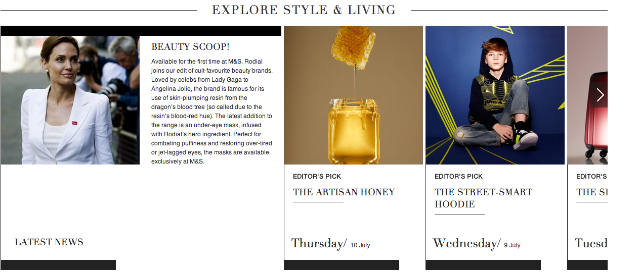
Where’s the sale? Call to actions on the new website
But before we get going, did you know 92.6% of visitors to a website are influenced by strong colours and visuals in their decision to make a purchase (Cox Blue 2013). Given this, it’s pretty clear that M&S have missed a trick with their new navigation bar which is plain with no bold call to action, let a alone a strong prompt for users to explore the ‘20% off on school uniform/Free Delivery/Sale Now’.
Whereas, if you look at the old navigation bar, we’d say this one’s much better defined with the use of colour differentiating static categories, stronger calls to action and a good use of icons to inform the user.
New website

Old website

Too much of a simplified shop window
It takes a maximum 3 seconds for a visitor to decide whether your site delivers on expectation, what’s more 96% of visitors land on a site not ready to buy (Cox Blue 2013), added to the fact competitors are biting at your heel, the pressure really is on for ecommerce sites to secure those sales. Unfortunately, M&S have again made an error in trying to fix something that didn’t need fixing with its homepage layout.
With only 2 fixed category options for users to select in comparison to the 6 categories on the old website, it’s clear which one is stronger in prompting and informing the user on where to go and what exactly the brand offers them. For us, those 3 seconds would’ve gone miles further with the old homepage layout than with the new.
New website

Old website

No clear value proposition
Earlier this week, Neil Saunders, Managing Director at retail research group Conlumino said M&S’s new website is ‘a literal victory of style over practicality’ and we can’t help but agree with his comment. We say this, because it’s obvious that the attention on aesthetics has altogether confused the brand’s value proposition – something that is no better reflected than in the overall layout of the homepage.
Whilst the old homepage showcases a full campaign, tying in the different categories the brand services, the new homepage not only misses out the likes of the Food & Wine, Flowers & Gift and Home & Garden but instead focuses on lifestyle and editors picks, which in truth, should act as supporting features rather than a main focus.
New Website
Old website

2. Issues with the checkout process
Without sounding too blunt, if an ecommerce build has aesthetics in mind over checkout, it normally leads to an impact on the bottom line. Really and truly making the process as easy as possible is crucial especially since today’s average cart abandonment rate is 67.91% (Baymard Institute 2014). Given the statistics we thought we’d have a look into this section as a user to see if it’s just that bit too easy to abandon a cart before completing a purchase.
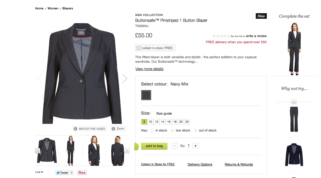
Selection of Goods
And there you have it, we’ve immediately come across an ecommerce blunder and that’s, ‘where’s the checkout call to action on the actual product detail page?!’
It’s frustrating and can easily lead to ‘abandoned cart syndrome’ (something no ecommerce owner ever wants to catch). What’s more, since the brand target the 25-44 online age group, who also happen to be the most likely to give up on a purchase, (Vouchercloud 2013) clear calls really can’t afford to be discounted.
Now before we take the ‘real’ checkout plunge, keep in mind that 5.08 steps is the average length of a checkout process among the top 100 grossing ecommerce sites, (Vouchercloud 2013) so we need to find out whether M&S meet this standard.
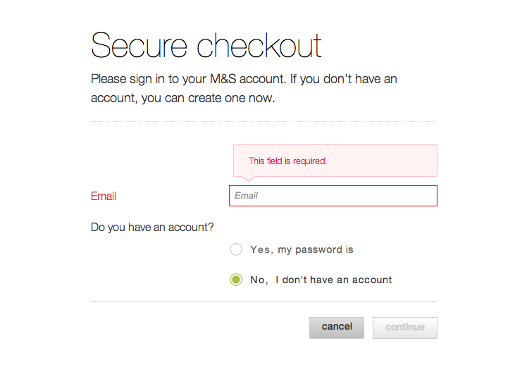
a) Secure Checkout: False hope
After clicking ‘checkout’ on the shopping basket, we’re asked to enter an email address as a compulsory requirement to then progress to the next step. Although the checkout process has started, asking the user to enter their email address immediately draws it out. And, given that 29% of people abandon a cart purely because they have no option to select ‘guest checkout’ (Vouchercloud 2013) we wonder whether the retailer has made a big mistake without having this option available.
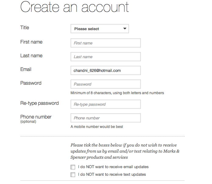
b) Create an account: More false hope
After entering an email address, we now have no choice but to create an account to get closer to actually purchasing an item. Although, there are no particularly frustrating questions on this page, having to enter a phone number doesn’t strike us as all that important. This again just wastes time and isn’t really necessary for first time buyers; what’s more 10% of all cart abandonments are due to a lengthy checkout process. (Vouchercloud 2013)
c) Starting the actual checkout process
It’s only after completing these 2 steps that we get to the actual checkout, (steps that really could’ve been avoided) by which time, it’s likely that many first time visitors would have clicked off abandoning their carts adding to the 67.91%.
![]()
Where the checkout process went wrong: No guest checkout option, 2 extra steps and 1 unnecessary question
It’s clear with M&S’s checkout process that maximising registrations seems to have taken precedent over swift checkout. Now, we can wholeheartedly guarantee that this would have had a significant impact on the rate of sales conversions given the statistics we’ve noted.
In a nutshell, we think M&S are doing themselves great harm in taking this approach especially by lengthening out the process given that ASOS (today’s most successful ecommerce store) halved their checkout abandonment rate just by adding ‘guest checkout’ as an option. (Econsultancy 2011) The proof then, really is in the pudding!
3. The move from old to new, the migration process
So we’ve already looked at 2 areas that would’ve had an impact on sales, but the ‘teething problems’ that Mr Bollard refers to is probably more to do with the migration process and how it was handled than anything else.
Now we’re no strangers to the fact that it’s always nerve wracking when it comes to ensuring good SEO ranking when migrating to a new site, so it was quite surprising to see that the retailer didn’t handle this quite as well as it could have.
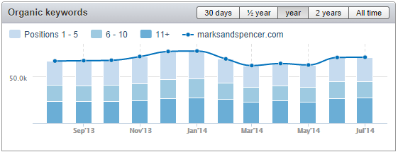
One of the things, we found particularly interesting was the massive drop of 10.5% in organic traffic from pre launch to post launch – an extremely frightening percentage for any business, so we think it’d be wrong to downplay the issue as just a teething problem.
What’s more, M&S lost ranking authority on certain keywords, (Google 1-5 position) those which would’ve been responsible in driving organic traffic to the site as this figure dropped from 37.89% to 25.60% from January 2014 to today. (Data collected by JBi via SEMrush 2014)
Now, whilst the situation seems to be improving for the retailer, (improvement on keyword ranking and traffic) it also gives us a clearer picture of the point at which things went belly up for the brand….quite simply the point of migration – something our digital friends at Digital Web Media also picked up in their review.
And on assessing the situation further, it seems that the issue had a much bigger impact than probably anticipated by the retailer itself, given that all 6 million registered on the website pre-launch were forced to re-register on the new website. (BBC 8 July 2014) Now we can only speculate here, but we imagine the 6 million would’ve lost their saved wishlists and baskets leaving many feeling more than a little miffed. It then comes as no surprise that since the launch that the retailer have only managed to get back 50% of their registered users pre-launch – so quite a fall indeed. It’s now that we can see the logic behind the compulsory registration on the checkout process, but our concern is that it’s clearly doing more harm than good and the statistics say so too.Our thoughts in summary for M&S
- Marks and Spencer’s needs to stop trying to cram in every ecommerce feature under the sun, (they’re a retailer not a creative agency, that’s our job!)
- Make calls to action stronger and stand out more as they had with the old site. We all love a bargain and simply adding the Sale tab back could be a start.
- Showing all your assets to your customer. We all know M&S, but do we all know their full product range? If you’ve got it, flaunt it.
- Make that checkout process easier! Allow for guest checkout, no extra steps and no unnecessary questions
- Finally, get your SEO up to date, since the re-launch, Marks and Spencer’s has fallen away on search engine authority and this would have had a significant impact on attracting that lost community let alone building an organic new one.
- Forget a quick fix with compulsory registration on the checkout process, work on that user journey!
There’s a lot to take in here, but it seems that M&S’s downward spiral online began when aesthetic website beauty overtook ecommerce practicality, something we know all too well.
It’s just interesting to see that even the biggest can have a fall, the key is to remember successful ecommerce is about three things, mastering people, prediction and subsequently making that return. But we’re optimistic, that M&S will get back on their feet, and we’ll definitely keep our eyes peeled for later on in the year especially since Mr Bolland’s promised ‘growth before the key Christmas trading months of November and December’ so all we’ve got to say is say watch this space for another review!
