

As a preempt for what was to come, in late 2014 Google introduced a ‘Mobile Friendly Test’ which enabled companies to test how responsive their website was. Now, a few months on, Google have made the jump they’ve been hinting at and introduced an algorithm designed to have considerable impact on mobile search results for mobile users. In order to fully understand this announcement, we will be examining the what, why and how’s to help shed some light on the fast-descending Googlebot that’s currently looming above your lovely website.
As of April 21st, if your website neglects to provide users with a mobile-friendly design you will be penalised by having your site’s SEO ranking lowered on Google, and, in association, companies that have optimised their site for mobile users will be rewarded by having their ranking improved. Google have already deployed ‘mobile-friendly’ labels to indicate which companies have optimised their website, aimed to encourage users towards a more positive search journey.
Sound fair? We think its pretty sweet that Google have decided to put mobile users first. I think we can all agree how frustrating it is to be pinching, swiping, zooming and scrolling our way around a website. It’s called surfing for a reason, and that’s because it’s meant to be enjoyable and smoooooth…
Given that 77% of us use mobile search at home or work; places that are likely to have desktop computers, it is important that we have positive mobile search experiences; and that is exactly Google’s primary aim.
The use of the mobile and tablet have become embedded in our daily lives, whether they’re being used to research a business pitch, find your next dream shoes or to order tonight’s dinner. Whatever the reason, it’s become common ground to expect a fast, easy-to-use mobile-friendly website; and this is certainly one step closer to guaranteeing that our expectations are met.
How do you achieve a ‘mobile-friendly’ website status?
If your website isn’t already responsive you need to get the ball rolling straight away to make sure its ready for the day that Googlebot comes crawling. Here are a few central ways to ensuring your website is awarded with that all-important mobile-friendly label:
- Place links far enough apart allowing users to easily tap the link they want
- Use a font and text size clear enough to read without zooming
- Avoid software that isn’t common on mobile sites, such as Flash
- Ensure the viewport fits the screen so users don’t have to scroll horizontally or zoom
If you work with a developer the issue can be resolved quite simply by requesting an update on your robots.txt file to remove a block on certain files. However, it may be a case that your website needs a whole redesign based around responsive web design and content that will work best on a mobile site… That option of course will take a lot more time and planning.
How can this impact your Ecommerce website?
There is a fair amount of mixed debate around the extent to which this algorithm will impact businesses. Let’s take a look at the mobile impact on Ecommerce websites selling shoes. I used my smartphone to search for “high heels”. As you can see 4 of the top 5 ranked on Google are already labelled mobile-friendly.
Google’s mobile-friendly annotation will now become part of the ranking signal, meaning search results will be reordered based on the relative mobile friendliness of the site.
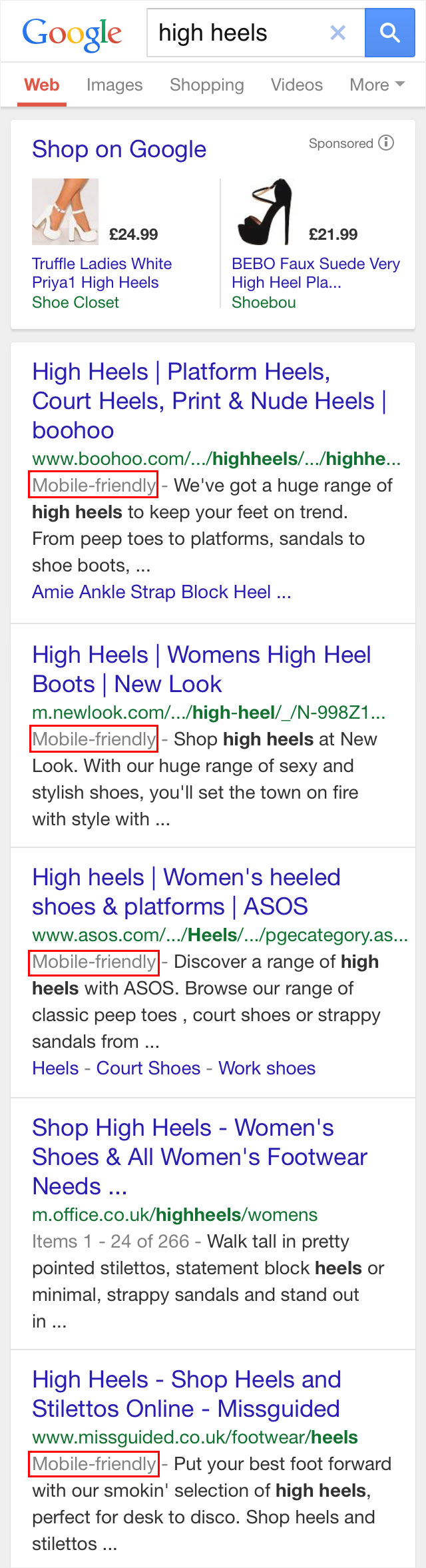
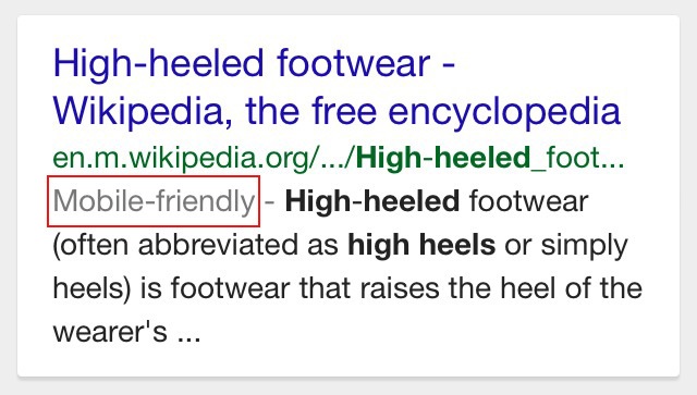
So, this means bad news for Office whose website is not currently mobile-friendly according to Google. At the bottom on my search page is Wikipedia, a website which is fully responsive. Therefore, the new algorithm could result in Wikipedia, an encyclopedia, being ranked higher than Office, a shoe shop, for high heeled shoes. Hmm…
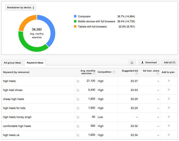
You might be thinking people nowadays don’t just ‘google’ key words, they look for brands or certain styles. Well, au contraire mon ami! There are 27,100 searches a month for “high heels”, 61.3% of which come from a mobile or tablet device.
Google Keyword Planner displays 38,550 average monthly searches for high heels with some kind of variation, such as “cheap high heels”.
These staggering statistics, showing that less than half of these searches are made on a desktop computer, demonstrates why it is imperative that your Ecommerce website is mobile-friendly. The search algorithm has the power to decrease your ranking and ultimately cost your store a significant amount of organic search traffic.
Don’t panic!
Although this may seem like a scary concept, it’s not the ‘be all to end all’ of your website. The overall impact of Google’s improvements on your business depends a great deal on how your website is performing today.
A great way to gain a full analysis of your website and its mobile accessibility is to run a full SEO audit (or ask your digital agency for help if you don’t know how). The results will tell you if we are talking tweaks or major work and then you can plan your next step.
Overall, we think Google are on to something great. Making your website mobile-friendly will not only potentially increase your traffic and conversions, but most importantly, it will make your customer happy; giving them the confidence to come back to your website in the future.


