Minimalism is far from a new concept. Decades ago with a wave of Japanese influence and Feng Shui styled design have influenced what users like to see. Since 2010 we have seen even more sparse, white space dominated designs and minimalism is definitely here to stay.
Opinion is divided on the success of this trend. Some people really go for it whilst others miss the tradition of skeuomorphic design methods. Skeuomorphism is a popular design choice and it means incorporating the look of an object that was produced in another material. Elements such as library sections which are made to look exactly like bookshelves and another example is the folders on your Desktop which look genuinely like paper folders in your filing cabinet.
The Popularity of Skeuomorphism
You will find skeuomorphism used across websites of large brands and small start-ups. UI design is packed full of it because it gives the user a sense of comfort. This is coupled with a familiarity which can provide confidence and support for non-advanced web users. However, web design is changing as we realise that the end user is more adaptable than we think and in fact is ready to embrace different types of interface more easily. Confidence has grown and something that looks different is to be explored not shied away from.
The Growing Popularity of Minimalism
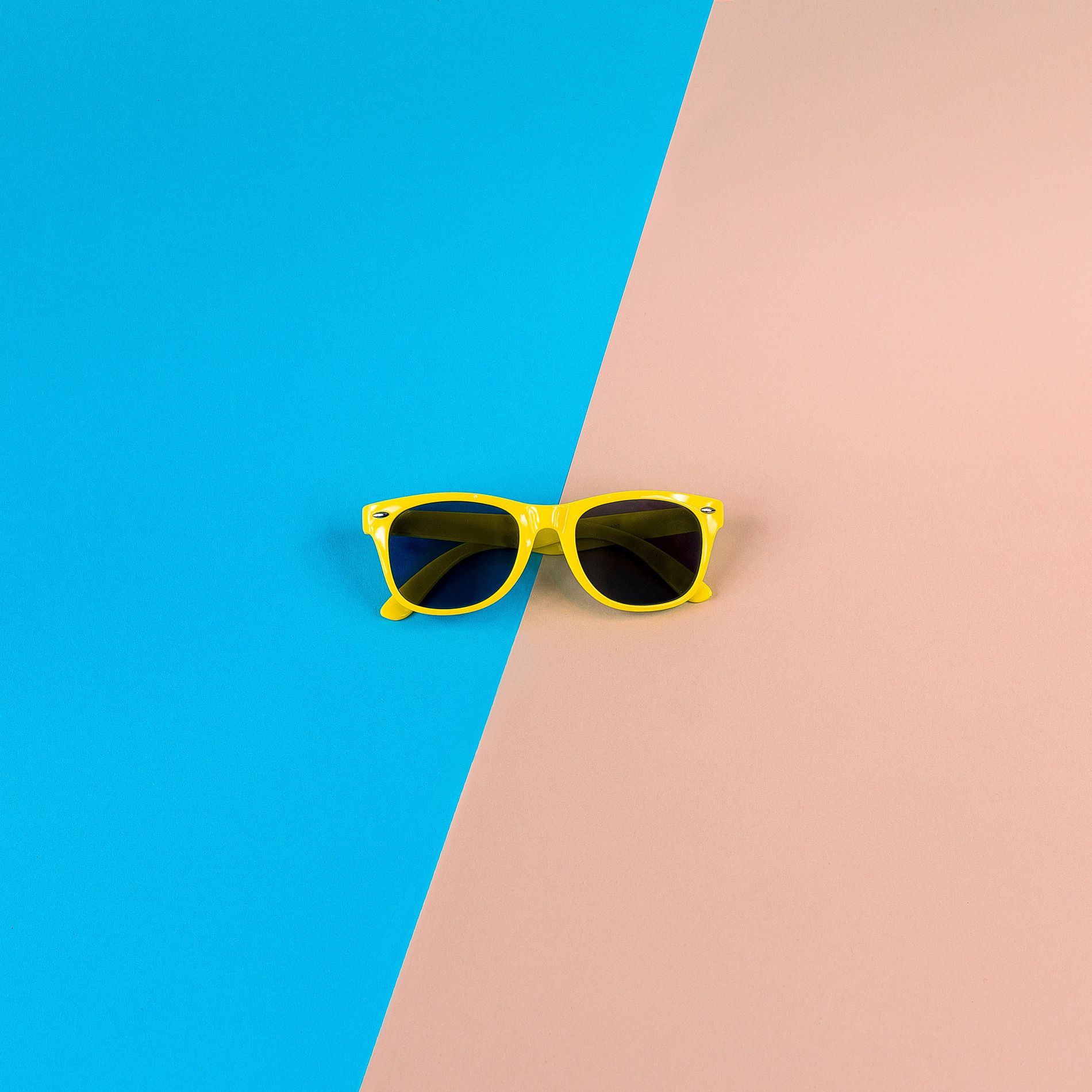
Minimalism is the exact opposite of skeuomorphism. It’s a reaction to this type of design and in fact rejects many traditional design elements from gradients to drop shadows. Minimalist web design is stripped basic, simple and bare.
Applying Minimalism to your Web Design
Minimalism doesn’t mean the removal of all visual elements, such as photographs or illustrations. You can incorporate them as key elements of your design but when employing minimalism the rest of the design would be completely flat. White space or empty space will be used regularly and buttons and icons will be completely flat without 3D embellishments.
Illustration can be highly effective in minimalist design. The simplicity of the frame, buttons and layout make illustrations even more striking than usual. The simple background means that bolder elements can be used to your benefit.
Minimalism can be taken further, to the extreme even, where only black and white are used and no images except simple shapes are used at all. This type of design needs a strong, direct message which needs nothing more than text to convey.
It is possible to take minimalism too far. There are examples where the designer has chosen only to use white and a pale shade of blue, making text hard to read and buttons hard to decipher. Aside from anything else sites with this kind of design are near impossible to use on mobile devices.
Breaking away from skeuomorphism doesn’t have to mean going to the extremes of minimalism. You can take a step back from the overuse of skeuomorphism and focus your designs on a realistic and responsive methods to suit your client. Web design isn’t an exact science and in many ways is more of an art form. Just because a trend is popular doesn’t mean you have to embrace it entirely. It’s highly possible that some of your clients simply won’t want a minimalist design and others will want elements of skeuomorphism worked in and that’s fine. Your client’s needs are what matter and if their users want these elements you can work with them in a way which works.
Minimalism is certainly the trend of the moment and many of your clients will benefit from this type of design but it isn’t the be all and end all. It is definitely worth keeping in mind and understanding it fully so you can utilise it when necessary.


