Don’t worry. If you are also thinking “that’s preposterous, I won’t buy something simply because of its colour” then you are not alone. We all probably wouldn’t admit to it however, believe it or not, we all do. Whether we like it or not, dependent on the colour scheme of a company’s branding or even a website, we become more or less willing to hand over the content of our wallets online, but only because we feel comfortable to do so.
The colour theory, invented by Sir Charles Lemieiux, is a complex science involving psychology, physics, and perception. Colour theory tackles perceptual and psychological effects to various colour combinations and contrasts. Since this science has been “discovered”, many of the largest companies in the world use this exercise in every aspect of their branding. Google “mood boards” and you will soon see how it all makes sense.
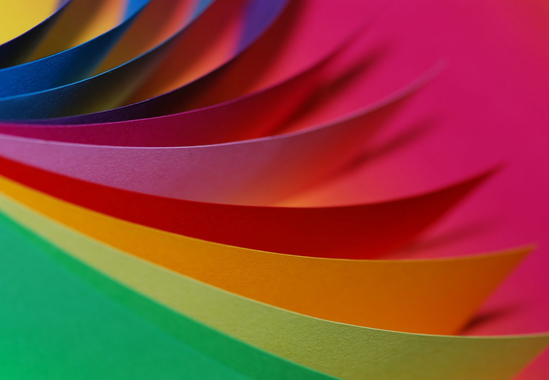
The basic physics of colours is reflected into everything that we see, and therefore how we reflect upon seeing these colours. For example, the sun; a mixture of yellow and oranges immediately make us think of positive emotions and those long-gone summer days outside in the garden cooking a BBQ and drinking a pear cider.
McDonalds as an example took advantage of this concept within their logo and never would we reflect upon the branding of this global fast-food chain as negative or upsetting, despite the consequences a Big Mac has on the population of America’s dress size.
Notice the relationship between the stereotypical emotion we have towards each colour versus those global brands we all recognise?
And why is it the majority of technology and engineering brands are on the left hand side, consisting of the colours green and blue?
Let me try and explain by looking at our logo and why we produced it the way it is.
Why is it designed the way it is and what was our logic behind it?
- The colour green reflects growth and technology.
- By doing our research, we noticed that companies in similar industries had a similar approach to colours schemes within their branding.
- The boss liked the colour green.
It’s a simple science but it was a logo everyone agreed to as we wanted a colour that forecasted growth! The logo is now over 6 years old so we are currently in the process of revamping our style and image into a state that better reflects what we have become and our visions for the upcoming future.
In all the websites we create here at JBi, we look to fully encapsulate the corporate image of your business and transfer it into a website that boasts creativity and fully displays everything that you are. Science even plays a part in our thinking!!
If you are looking for your next digital partner and to take your business to the next level, contact our sales team on 0207 078 4328.